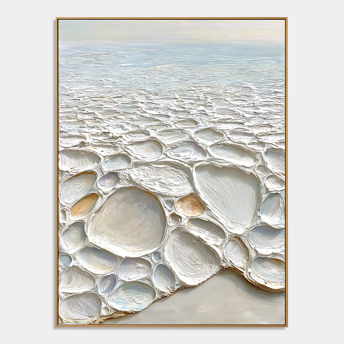
Earthy plaster artwork works best when you want texture without visual noise. The right piece adds warmth, depth, and a grounded feel to a room, especially when it uses beige, taupe, warm brown, cream, or charcoal instead of stark white. It is a strong choice for modern interiors because it softens hard surfaces, but the finish, framing, and wall color have to work together or the piece can feel flat instead of refined.
Why earthy plaster artwork feels different
Earthy plaster artwork stands out because it is as much about surface as it is about color. Neutral tones are only part of the effect; the layered texture creates shadow, softness, and that quiet, architectural presence people often want in a calm home. On a white wall, a warm plaster piece can stop the room from feeling sterile. On a beige or greige wall, it can deepen the palette without making the space feel busy.
Where it fits best
This style works especially well in living rooms, minimalist bedrooms, and entryways where you want one strong visual moment rather than a wall full of objects. It also suits spaces with oak, walnut, linen, stone, or matte black accents because those materials echo the same grounded, natural feeling. If a room already has a lot of pattern, glossy finishes, or high contrast, earthy plaster artwork may still work, but it usually needs more breathing room around it.
Choosing the right color family
The safest way to choose is to match the artwork’s temperature to the room’s main materials, not just to the paint color. A warm beige or clay tone usually works well with wood and soft textiles, while deeper brown or charcoal plaster tones can anchor rooms with stronger contrast. The goal is not perfect matching; it is a believable relationship between wall, frame, and furnishings.
What often goes wrong
The most common mistake is buying plaster wall art only for the color and ignoring the texture scale. A heavily layered piece can feel too rough in a very small room, while an overly smooth piece can disappear on a large blank wall. Another expectation gap is thinking plaster-style art should mimic a DIY wall finish; professional layered plaster art is meant to stay crisp, framed, and durable as decor, not behave like a temporary craft surface.
How to use it in real rooms
In a living room, one large earthy plaster piece usually has more impact than several smaller works because it preserves the calm, architectural feeling. In a bedroom, softer beige or cream tones keep the mood restful, especially if the bedding and curtains are already neutral. In an entryway, a warm arch or curved form can make a narrow wall feel intentional without adding clutter.
Where Acousart fits
Acousart’s plaster wall art collection is relevant when you want the look of tactile, mineral-inspired artwork without treating the wall as a DIY experiment. Pieces such as Beaded Arch Neutral Textured Abstract Wall Art and Soft Path Neutral Textured Abstract Wall Art fit this brief well because they lean into layered texture, restrained color, and ready-to-hang presentation. That makes them a better match for homeowners who want a finished look rather than a project that may crack, age unevenly, or need rework.
Cleaning and care
Matte plaster wall art should be cleaned gently so the surface texture stays intact. A soft, dry microfiber cloth is usually the safest first step, and anything damp should be used sparingly and only if the piece’s care instructions allow it. Avoid abrasive cloths, strong sprays, and aggressive wiping, because textured finishes can show wear faster than smooth printed art.
Frequently Asked Questions
What style of room fits earthy plaster artwork best?
It fits best in quiet, neutral rooms that already use natural materials such as wood, linen, stone, and matte finishes. Living rooms, bedrooms, and entryways are the most natural settings because the artwork can act as a calm focal point rather than compete with the rest of the decor. The more restrained the room, the more convincing the piece usually feels.
Does neutral plaster art work on off-white walls?
Yes, but the contrast has to be deliberate. On off-white walls, choose a piece with enough tonal depth, such as warm beige, taupe, or soft brown, so the artwork does not disappear into the wall. A thin wood or dark frame can also help define it.
Is earthy plaster artwork only for minimalist interiors?
No, but minimalist interiors make the effect easiest to see. It can also work in organic modern, wabi-sabi, and quiet-luxury rooms where texture matters as much as color. In busier interiors, it usually needs a calmer wall and fewer competing objects nearby.
How do I choose between beige, brown, and charcoal tones?
Choose beige when you want softness, brown when you want warmth, and charcoal when you want more contrast. Beige blends easily with light interiors, brown pairs well with wood and natural fabrics, and charcoal helps a light wall feel more structured. The best choice depends on whether you want the art to blend in or stand out.
Can plaster-style wall art replace a DIY plaster finish?
No, and that is the wrong comparison. A framed plaster-style artwork gives you the tactile look of layered texture in a durable, ready-to-hang form, while a wall finish is part of the architecture and behaves differently over time. If you want decor rather than renovation, artwork is usually the more practical choice.