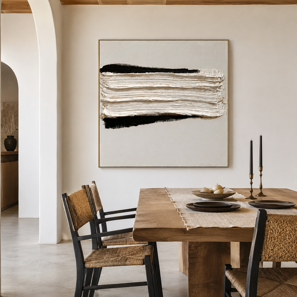
Minimalist rooms with stark white walls and glass windows often suffer from high-contrast echoes—hard surfaces amplify sound while color-free interiors demand visual purity. Monochrome acoustic art solves both challenges simultaneously: bold black-and-white textured surfaces provide visual weight as an architectural anchor while the layered acoustic core inside absorbs ambient reflections. Unlike industrial foam panels or flat printed art, these hand-painted pieces use raised monochrome textures that behave differently under intentional gallery lighting, softening harsh flutter echoes without compromising an ultra-clean aesthetic.
Why Minimalist Spaces Create Harsh Echoes
The acoustic problem in minimalist interiors isn't obvious at first—you feel it before you hear it. Conversations blur, echoes linger too long, and your carefully designed space starts to feel "off". Three design elements amplify this:
The tension is clear: you want to tone down sound without introducing color or industrial-looking treatment. Traditional foam panels fail here because they look like studio hacks rather than design upgrades.
How Monochrome Acoustic Art Works Differently
Monochrome acoustic art combines handmade oil painting aesthetics with a layered acoustic core behind the canvas surface. The textured surface isn't just decorative—it breaks up sound waves through material density and surface irregularity.
Key differences from competitors:
-
Texture vs. Flat Print: Raised monochrome surfaces interact with light differently throughout the day, creating shadow and depth that flat black-and-white prints lack
-
Acoustic Core vs. Foam: Instead of visible industrial foam, the soft internal core absorbs reflected sound while the exterior reads as elite gallery art
-
Hand-Painted vs. Mass-Produced: 100% hand-painted oil art means no mass-produced prints, giving each piece sculptural depth
Most competitor guides treat black-and-white as a flat print, missing the premium feel of a raised surface that softens echoes.
Styling a Single Oversized Canvas vs. a Diptych
When splitting a large wall space, you face a decision: one massive monochromatic statement piece versus a synchronized diptych. The choice depends on your room's acoustic needs and visual anchor point.
A single massive piece works best when you need one dominant anchor for an echoey room—it acts as both art and acoustic treatment in one location. A diptych is preferable when sound bounces across a long sofa plane; two panels capture reflections at multiple points without overwhelming the wall.
For example, the Cosmic Tide Diptych uses bold dark tones in two synchronized canvases to calm acoustics while maintaining visual balance across a wide wall.
Where to Place Monochrome Panels for Best Sound Dampening
Placement matters more than quantity. Misplaced panels reduce effectiveness, even if you have multiple pieces.
Strategic positioning rules:
-
First reflection points: Side walls or behind seating areas where sound bounces first
-
Adjacent walls to hard surfaces: Place near glass windows or hardwood floors to interrupt replay echoes
-
Key reflection zones: Behind seating areas or on walls facing open-plan spaces
In an open-plan apartment with hard flooring and large windows, installing panels along these points changes how sound travels. Users notice voices become clearer and less "sharp," even if the room doesn't feel heavily treated.
When Monochrome Acoustic Art Fails Expectations
This is the most common gap between expectation and reality: users expect immediate, dramatic soundproofing instead of gradual acoustic improvement.
Common failure points:
-
Large empty rooms need multiple panels: One feature piece won't fix a 400-square-foot room with 80% hard surface area
-
Impatience: Installing a single panel and expecting transformation, then assuming the product doesn't work
-
Underestimating hard surfaces: Users forget how much glass, wood, and metal contributes to echo before buying
Acoustic improvement is cumulative and context-dependent. Most users adjust over a few days as their ears adapt, and improvements become more noticeable during conversations or quiet moments.
Who Should Choose Acoustic Wall Art vs. Traditional Panels
Not everyone needs acoustic wall art. Choose based on your priority: aesthetics or maximum performance.
If you need complete soundproofing or external noise isolation, acoustic wall art won't work—you'll need structural changes and different materials. Acousart's layered acoustic core provides partial absorption and diffusion, improving perceived acoustic comfort rather than eliminating noise.
Exploring the Black-and-White Color Collection
For minimalists who need visual purity with acoustic function, the black and white textured wall art collection offers hand-painted pieces with deep charcoal and stark white textures.
One standout option is the black and white abstract textured wall art, which features bold dark tones that provide visual weight while calming room acoustics through its soft internal core. The raised monochrome surface creates sculptural depth that flat prints cannot achieve, making it ideal for executive home offices or stark white living rooms where color is strictly prohibited.
Browse the full black and white textured wall art collection to find pieces that anchor your echoey room while maintaining ultra-clean contrast.
Frequently Asked Questions
Does black and white acoustic art help with echoes in minimalist rooms?
Yes, moderately effective especially where hard surfaces dominate. Performance depends on placement and room size—small to medium rooms notice clearer speech, while larger spaces require multiple panels.
Where should I place monochrome acoustic panels for the best sound dampening?
Place at first reflection points: side walls, behind seating areas, or adjacent to glass windows. Strategic positioning delivers better results than quantity.
Can artistic acoustic panels replace traditional foam panels?
Yes, but only when you accept that function and aesthetics are integrated. A single well-placed acoustic piece can replace multiple decorative items while improving sound quality, though traditional panels deliver stronger absorption.
Why don't I notice an immediate difference after installation?
Because acoustic changes are subtle and cumulative. Most users adjust over a few days as their ears adapt.
Will monochrome acoustic art work in a room with zero color?
Yes, that's the primary niche. Black-and-white textured art satisfies ultra-clean, high-contrast aesthetics while providing soft internal core absorption.