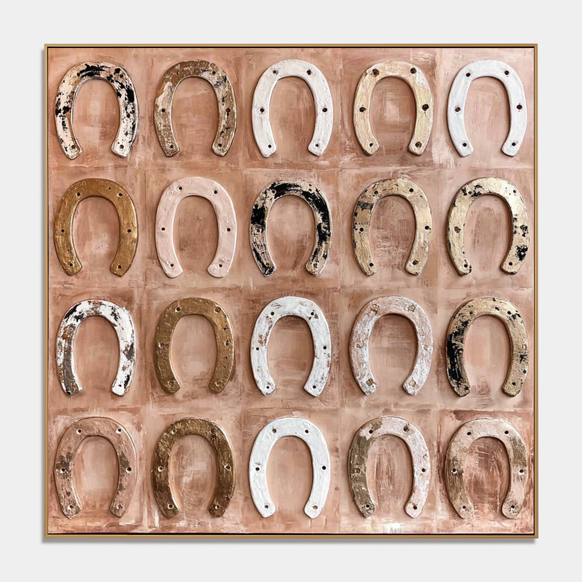
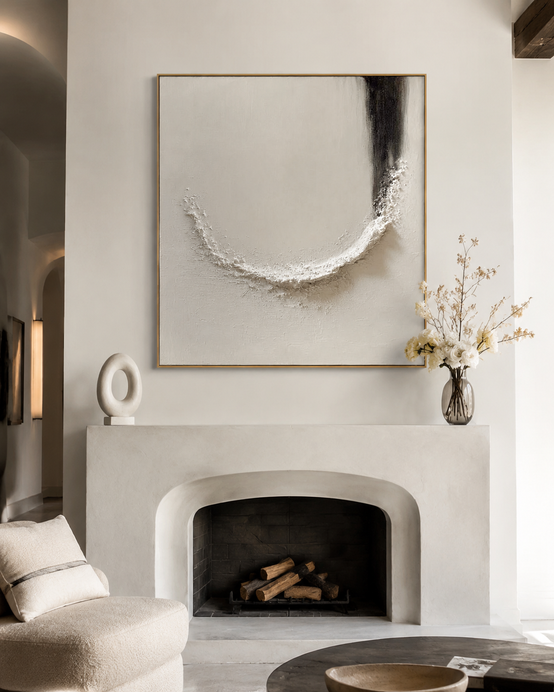
3D gallery wall art works best when it looks intentional from across the room and still rewards a closer look. The basic idea is simple: use dimension, spacing, and grouping to create a wall display that feels architectural rather than flat, which is why set of 2 wall art and set of 3 wall art formats often outperform a random frame collage for large living rooms, dining areas, and hallways.
Why 3D changes the gallery wall
A traditional gallery wall relies mostly on image variety and frame alignment. A 3D gallery wall art display adds surface depth, shadow, and texture, so the wall changes as light moves through the day. That makes it especially effective in spaces with windows, tall ceilings, or long sightlines where flat posters can disappear visually.
This is also why contemporary wall art with texture tends to feel more finished in modern interiors. The wall itself becomes part of the composition, not just the background. If the room already has clean lines and smooth drywall, 3D pieces introduce movement without making the space feel busy.
Choose the right format first
Before you think about spacing, decide whether the wall needs one large anchor or a multi-panel layout. A single oversized piece is usually the better choice when the wall is narrow, the furniture is compact, or you want one strong focal point with less visual interruption. A diptych or triptych is usually better when you want rhythm, wider coverage, or a story that unfolds across panels.
If the room already contains a lot of decor, a set of 2 wall art can feel calmer than a full collage. If the room is large and understated, a set of 3 wall art usually gives you more range and a stronger architectural read. The goal is not to fill every inch; it is to match the visual weight of the wall.
Step 1: Calculate spacing
The most common mistake is treating spacing like an afterthought. For multi-piece 3D gallery wall art, even gaps matter because they control how the eye moves from one panel to the next. A smaller gap makes the grouping feel like one unified object, while a wider gap makes each piece feel more independent.
As a rule, keep spacing consistent within the set and let the furniture below it set the width. Over a sofa or buffet, the grouping should usually sit centered and occupy most of the furniture span without running edge to edge. That keeps the wall from feeling either undersized or overcommitted.
Step 2: Balance the depth
This is where 3D abstract wall art becomes more interesting than a flat print set. Texture changes how the pieces interact with daylight, sconces, and ceiling fixtures, so the wall should be planned with light direction in mind. A textured surface near a window often creates a more active shadow pattern than the same piece placed in a darker corner.
That does not mean every panel needs to be equally dramatic. In fact, the strongest layouts often pair quieter sections with more pronounced texture so the eye has a place to rest. If every panel competes at the same intensity, the display can look busy instead of layered.
What can go wrong
The biggest expectation gap is assuming any multi-panel artwork will automatically feel like a gallery wall. If the scale is wrong, the layout can look decorative but not designed. If the panels are too close together, the composition can lose breathing room; if they are too far apart, the story between the pieces disappears.
Another common issue is choosing texture only because it looks impressive in a product photo. 3D wall art is most effective when the room has enough natural or artificial light to reveal the surface. In a dim hallway or heavily shaded room, the dimensional effect may be subtler than expected, so the piece can feel closer to a standard painting than a sculptural object.
How to style it in real rooms
For a living room sectional, a wide horizontal grouping usually feels best because it echoes the furniture line below it. For a dining room buffet, a set of 2 wall art can be enough to create balance without fighting the table or chairs. For a dramatic hallway, a vertical pair or staggered triptych can make the passage feel intentional instead of empty.
If you are mixing flat and textured work, keep one unifying element constant, such as tone, subject, or frame finish. That prevents the wall from reading as a random assortment. A single 3D piece can also act as the anchor while flatter works stay secondary around it.
When Acousart fits
Acousart is a natural fit when you want the wall display to feel more dimensional than a conventional framed collage. The brand’s 3D Collection and multi-piece formats make sense for buyers who want contemporary wall art that can act as both a focal point and a design system for larger walls. Pieces such as a Black and White Wall Art Cosmic Tide Diptych or Midnight Tides Diptych show how a split composition can carry motion across two panels instead of compressing it into one static canvas.
That matters most when you are choosing between a single oversized statement canvas and a coordinated set. If the room needs flow, separation, and a more architectural rhythm, a diptych or triptych is usually the stronger answer. If the room only needs one decisive anchor, a single large piece is easier to live with.
Frequently Asked Questions
What is the best spacing for a set of 2 wall art?
The best spacing is usually consistent and modest enough to make the pair feel connected without merging into one block. The right gap depends on the wall size, the furniture below it, and how much visual separation you want, but consistency matters more than chasing a fixed number.
How do you arrange a set of 3 wall art over a sofa?
Center the trio over the sofa and keep the grouping wide enough to feel related to the furniture beneath it. A straight horizontal line is the safest choice, while a stacked or slightly staggered layout works better when the wall is tall or narrow.
Can you mix 3D abstract wall art with flat paintings?
Yes, as long as you keep one shared visual thread such as color, tone, or framing. The mix works best when the textured piece acts as the anchor and the flatter works support it rather than compete with it.
Is a single large wall art piece better than a multi-panel set?
A single large piece is better when you want simplicity and one clear focal point. A multi-panel set is better when the wall is wide, the furniture is long, or you want movement across the surface.
Do 3D textured pieces work in low-light rooms?
They still work, but the dimensional effect is less pronounced. If the room has limited light, choose a piece with stronger contrast or place it where a lamp or window can catch the surface.