
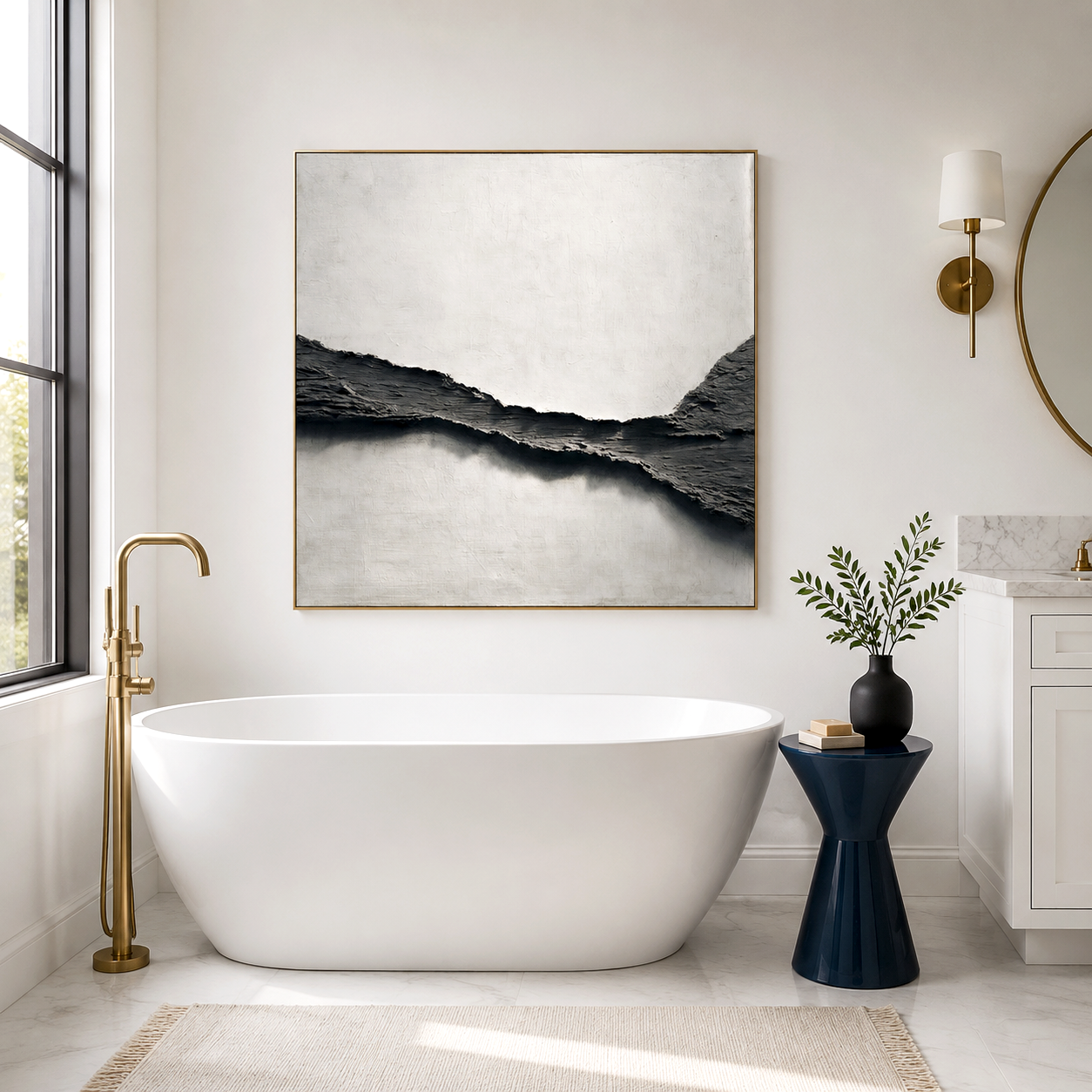
A nursery can look visually serene and still feel surprisingly harsh at night. Glossy prints under a nursing lamp bounce sharp reflections across the room, while bare drywall and wood flooring let every whisper, cry, or lullaby ricochet into a faint but constant flutter echo. Modern nursery art, when chosen carefully, can do more than decorate—it can reduce visual glare, soften the room’s acoustic edge, and remove physical hazards above a crib. The key is shifting away from glass-covered frames and high-contrast imagery toward lightweight, matte, textured pieces that calm both the eye and the soundscape.
Why glossy nursery art often feels overstimulating at night
In daylight, a framed print might look harmless. At 2 a.m., under a single directional lamp, it behaves very differently. Glass and high-gloss finishes reflect light in concentrated streaks, creating subtle flicker and movement as parents shift or rock the baby. Infants are particularly sensitive to contrast and motion, so even small light shifts can feel active rather than calming.
Color intensity compounds the issue. Saturated cartoons or high-contrast black-and-white prints introduce visual “edges” that keep the eye engaged. In a space meant for winding down, this constant stimulation works against sleep routines.
Matte, neutral-textured surfaces behave in the opposite way. Instead of bouncing light, they diffuse it. A hand-finished plaster or textured canvas surface breaks up glare into a soft, even glow, which keeps the room visually stable even when lighting changes.
The echo chamber effect inside a minimalist nursery
Minimalist nurseries often rely on clean walls, simple furniture, and open floor space. Acoustically, that combination can create a small echo chamber.
Hard surfaces—painted drywall, wooden floors, and even large wardrobes—reflect high-frequency sounds easily. When a baby vocalizes or a parent speaks softly, those sounds can bounce between parallel walls, producing a faint but noticeable flutter effect. It is not loud, but it adds a layer of sharpness that makes the room feel less settled.
Textured wall art with layered or mineral-based finishes helps interrupt that pattern. Instead of sound waves reflecting cleanly, the uneven surface disperses them slightly. When paired with internal soft cores, these pieces can help soften the perceived harshness of reflections within the room. This is not soundproofing and will not block outside noise, but it can make the interior sound environment feel less brittle and more controlled.
Safety first means eliminating glass above the crib
Aesthetic choices in a nursery cannot ignore physical risk. Traditional framed art introduces two concerns: weight and breakage.
Glass-fronted frames are heavier and, if improperly secured or disturbed over time, pose a shattering risk. Even metal frames can become dangerous if installed directly above a crib or changing area.
Lightweight, glass-free construction changes that equation. Wrapped canvas formats with wood support structures remove the possibility of shattered glass entirely and reduce overall load on wall anchors. The result is a safer overhead condition when properly installed.
Safe placement still matters. Artwork should always be mounted securely into studs or with appropriate anchors and positioned well out of a child’s reach, never directly within grab distance from the crib edge.
A nursery sensory audit matrix for smarter art selection
Instead of choosing art based only on style, it helps to evaluate how each option behaves physically in the room.
Below is a simplified way to compare common nursery wall art types:
This is where many modern parents shift their approach: from “what looks cute” to “what behaves calmly in real conditions.”
The role of neutral palettes in reducing visual noise
Color selection is not just aesthetic—it directly affects how busy a space feels. Warm creams, soft beiges, taupes, and off-whites create low-contrast transitions that allow the eye to rest.
Textured neutral art adds depth without introducing sharp boundaries. Instead of bold outlines or graphic figures, it relies on shadow, material variation, and subtle tonal shifts. This creates interest for adults while remaining visually quiet for infants.
Wabi-sabi inspired pieces are particularly aligned with this approach. Their irregular textures and imperfect surfaces naturally diffuse both light and attention. For parents exploring this direction, the Wabi-Sabi minimalist art collection offers examples of how organic texture and restrained color can coexist in a nursery without feeling sterile.
Placement decisions that actually affect comfort
Where the art sits matters as much as what it is. Hanging a single piece on a random wall rarely changes how the room feels.
Positioning works best when it responds to both light and sound paths. Walls that face the crib or sit opposite major light sources tend to create the strongest reflections. Placing textured, matte artwork on those surfaces helps intercept both glare and sound bounce.
Height is equally important. Art should sit above adult eye level but remain clearly outside a child’s reach zone as they grow. Avoid placing pieces directly over the crib unless there is absolute confidence in secure mounting into studs and sufficient vertical clearance.
A common mistake is centering artwork purely for symmetry above the crib. Visually it works, but it places weight and potential risk in the most sensitive area of the room. Shifting art to adjacent walls often achieves a better balance between design and safety.
Where textured modern nursery art fits and where it does not
Textured, glass-free modern nursery art is a strong fit for rooms that feel slightly echo-prone, visually busy under artificial light, or overly sharp due to hard finishes. It complements minimalist interiors where every surface plays a larger sensory role.
It is less relevant in heavily furnished nurseries already filled with rugs, curtains, and upholstered pieces that absorb both light and sound. In those cases, the acoustic benefit is less noticeable, and the decision becomes primarily aesthetic.
For those seeking a balance of calm visuals, reduced glare, and softer room acoustics, collections built around neutral textured canvases—such as Acousart’s plaster-based and minimalist works—offer a direction that aligns with both safety and sensory comfort. A piece like the Silent Center minimalist neutral textured wall art illustrates how subtle surface depth can replace high-contrast imagery without leaving the wall feeling empty.
Frequently Asked Questions
Why should you avoid glass-covered picture frames inside a baby's room or nursery?
Glass frames can reflect harsh light and introduce a breakage risk if not securely installed, making them less suitable for areas near a crib.
Can textured neutral canvas art help reduce echo and noise reflections in an empty nursery?
Yes, textured surfaces and soft internal structures can help disperse high-frequency reflections, making the room feel less acoustically sharp, though they do not block outside noise.