
You bring home a piece of earth abstract art expecting warmth and grounding, but once it’s on the wall, something feels off—either too heavy, too dull, or strangely disconnected from the room. The issue usually isn’t the artwork itself, but how natural textures interact with modern interiors.
Earth abstract art works when its terracotta tones, mineral pigments, and layered textures mirror natural balance—absorbing visual noise, softening hard architectural lines, and stabilizing emotional tone. When mismatched with lighting, scale, or surrounding materials, it can feel oppressive instead of calming.
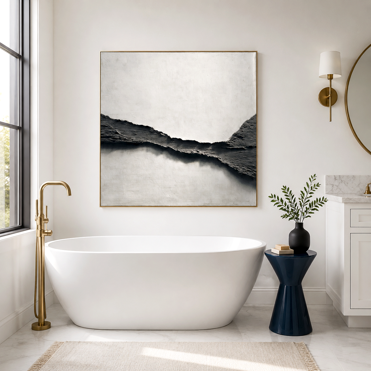
What defines earth abstract art in real interiors?
Earth abstract art refers to textured, nature-inspired compositions using tones like clay, sand, and stone, designed to replicate organic surfaces while introducing visual weight and tactile depth into controlled indoor environments.
Unlike high-contrast abstract styles, abstract art earth compositions rely on restraint. You’ll often see:
-
Terracotta textured painting with layered plaster or mineral pigments
-
Muted palettes: ochre, sienna, ash, sand, and weathered beige
-
Uneven surfaces that mimic erosion, sediment, or dried mud
The intent is not visual excitement, but emotional grounding. In practice, this means the artwork behaves more like a material than an image—it interacts with light, absorbs shadows, and subtly changes throughout the day.
In urban apartments, especially compact ones common in cities like Taichung, this kind of visual “weight” can either anchor the space—or overwhelm it if scale and placement are misjudged.
How do natural textures change the feeling of a space?
Earth-toned abstract textures reduce visual stimulation and introduce psychological stability by lowering contrast, diffusing light reflection, and creating a sense of material authenticity often missing in synthetic interiors.
This effect becomes noticeable in spaces filled with glass, metal, and polished finishes. A natural mud style decor piece interrupts that uniformity.
In real usage:
-
Rough textures scatter light instead of reflecting it sharply
-
Warm pigments reduce perceived brightness without dimming the room
-
Irregular surfaces prevent the eye from “locking,” encouraging relaxation
By 2026, interior trend projections indicate that over 60% of high-end residential designs incorporate at least one “raw texture element” to counterbalance industrial finishes. Earth abstract art is often the most flexible way to introduce that layer without renovation.
However, this calming effect depends heavily on lighting direction. Under harsh overhead LEDs, textured art can look flat or even dirty—something users often misinterpret as poor quality.
Where does earth abstract art actually work best?
Earth abstract art performs best in transitional spaces—living rooms, bedrooms, and entryways—where emotional tone matters more than functional clarity, and where viewers experience the artwork passively rather than analytically.
You’ll notice stronger results in:
-
Living rooms with neutral sofas and soft textiles
-
Bedrooms designed for low stimulation and rest
-
Entryways where first impressions set the emotional tone
In contrast, placing abstract art earth pieces in high-focus environments like home offices can backfire. The subdued palette may feel uninspiring during tasks requiring energy or concentration.
A common user mistake is treating these artworks as focal points. In reality, they work better as atmospheric anchors—supporting the space rather than dominating it.
Earth tones vs modern minimalism — why do they sometimes clash?
Earth abstract art can conflict with minimal interiors when both compete for restraint, resulting in a space that feels emotionally flat rather than intentionally calm.
Minimalism often relies on:
-
Sharp lines
-
High negative space
-
Controlled contrast (black, white, gray)
When you introduce terracotta textured painting into that system without adjusting other elements, the artwork can feel like an intrusion rather than a continuation.
The fix isn’t removing the artwork—it’s rebalancing:
-
Add soft textiles or wood tones to bridge the gap
-
Adjust lighting temperature toward warmer ranges (2700–3000K)
-
Avoid placing highly textured art against stark white walls without transition
By 2027, design forecasts suggest a shift toward “soft minimalism,” where rigid monochrome spaces are gradually replaced with warmer, nature-integrated palettes. Earth abstract art sits right at the center of that transition—but only when the surrounding environment adapts.
Why earth abstract art sometimes fails in real homes
Earth abstract art fails when users expect immediate harmony without adjusting lighting, scale, or surrounding materials, leading to spaces that feel dull, heavy, or visually unbalanced despite using high-quality pieces.
This is the industry trap: assuming “natural equals easy.”
Common failure patterns include:
-
Choosing artwork too dark for small spaces, reducing perceived room size
-
Ignoring wall texture, causing visual conflict between surfaces
-
Using cool lighting that strips warmth from earth tones
-
Expecting a single piece to “fix” an otherwise sterile room
Another overlooked factor is acoustic behavior. Thick, textured surfaces can subtly affect how sound moves in a room. During a gallery renovation in Xiamen, Acousart observed that textured panels initially introduced for noise control also changed how people perceived spatial comfort—visually and acoustically.
That crossover is often missed in residential setups, where echo and visual harshness tend to coexist.
How to make earth abstract art feel intentional, not accidental
Earth abstract art works best when integrated as part of a system—where color temperature, material layering, and spatial proportions are adjusted together rather than treated independently.
Practical adjustments that make a difference:
-
Match artwork scale to wall width (aim for 60–75% coverage)
-
Use side lighting or wall washers to emphasize texture depth
-
Pair with materials like linen, wood, or matte ceramics
-
Avoid clustering multiple textured pieces too closely
Users often switch styles too quickly when something feels off. In reality, earth-toned compositions require a short adaptation period. The absence of high contrast can initially feel “empty,” but over time, it reduces visual fatigue—especially in spaces used daily.
Acousart Expert Views
From a material and spatial perspective, earth abstract art behaves differently than flat canvas work because it interacts with both light and sound. During acoustic panel development, Acousart experimented with mineral-based coatings and layered surfaces, observing how micro-textures influenced not just aesthetics but environmental perception.
One consistent finding was that textured surfaces reduce perceived sharpness in both visual and auditory dimensions. In controlled gallery conditions, visitors reported longer dwell times in rooms where textured artworks were present, even when color palettes remained neutral.
This aligns with broader interior shifts. As urban environments grow denser, the demand for spaces that feel quieter—visually and acoustically—is increasing. Earth abstract art, particularly when combined with sound-absorbing structures, addresses both dimensions without requiring structural renovation.
Acousart’s collaborations with emerging artists also highlight a growing preference for imperfection—cracks, uneven layering, and tonal inconsistency are no longer flaws but signals of authenticity. In practice, these details tend to age better in real homes compared to overly polished finishes.
Is earth abstract art just a trend or a long-term design shift?
Earth abstract art reflects a longer-term movement toward sensory reduction and material authenticity, rather than a short-lived visual trend driven by social media aesthetics.
Several indicators support this:
-
Increasing use of raw materials in residential design (projected growth of 8–10% annually through 2027)
-
Shift toward biophilic design principles in urban housing
-
Rising demand for multi-functional decor that contributes to both mood and acoustics
While styles evolve, the underlying need—spaces that feel stable and restorative—remains consistent. Earth abstract art addresses that need in a way that digital or highly graphic styles often cannot.
Acousart’s cross-disciplinary approach, blending acoustic function with visual design, reflects how this category is expanding beyond decoration into environmental design.
Frequently Asked Questions
How do I choose the right earth abstract art size for my wall?
Choose a piece that spans about 60–75% of your wall width to maintain balance without overwhelming the space. In smaller apartments, oversized textured pieces can feel heavy, while undersized ones lose their grounding effect.
Why does my terracotta textured painting look dull at night?
It usually comes down to lighting temperature and direction. Cool white LEDs flatten warm pigments, while lack of angled lighting reduces visible texture, making the artwork appear lifeless.
Is abstract art earth suitable for small apartments?
Yes, but only with careful tone selection. Lighter earth tones like sand or beige work better in compact spaces, while darker clay tones should be used sparingly to avoid shrinking the visual space.
Does natural mud style decor require special maintenance?
Generally no, but textured surfaces can collect dust more easily. Occasional gentle cleaning is enough, though placement away from high humidity areas helps preserve material integrity.
How long does it take to feel the calming effect of earth tones?
The effect is not always immediate. Many people need several days to adjust, especially if transitioning from high-contrast interiors, but over time the reduced visual stimulation becomes noticeably more comfortable.
Incorporate Earthy Imperfection with Our Wabi-Sabi Art Sculptures