
Marine serene works best when a room needs more than decoration: it needs visual cooling, a softer atmosphere, and a surface that calms a wall without making the space feel flat. In practice, this style is less about beach imagery and more about deep blue texture, layered light, and a sense of stillness that can make busy interiors feel more settled.

Shop the Whispers of the Ocean Series for a Serene Coastal Vibe
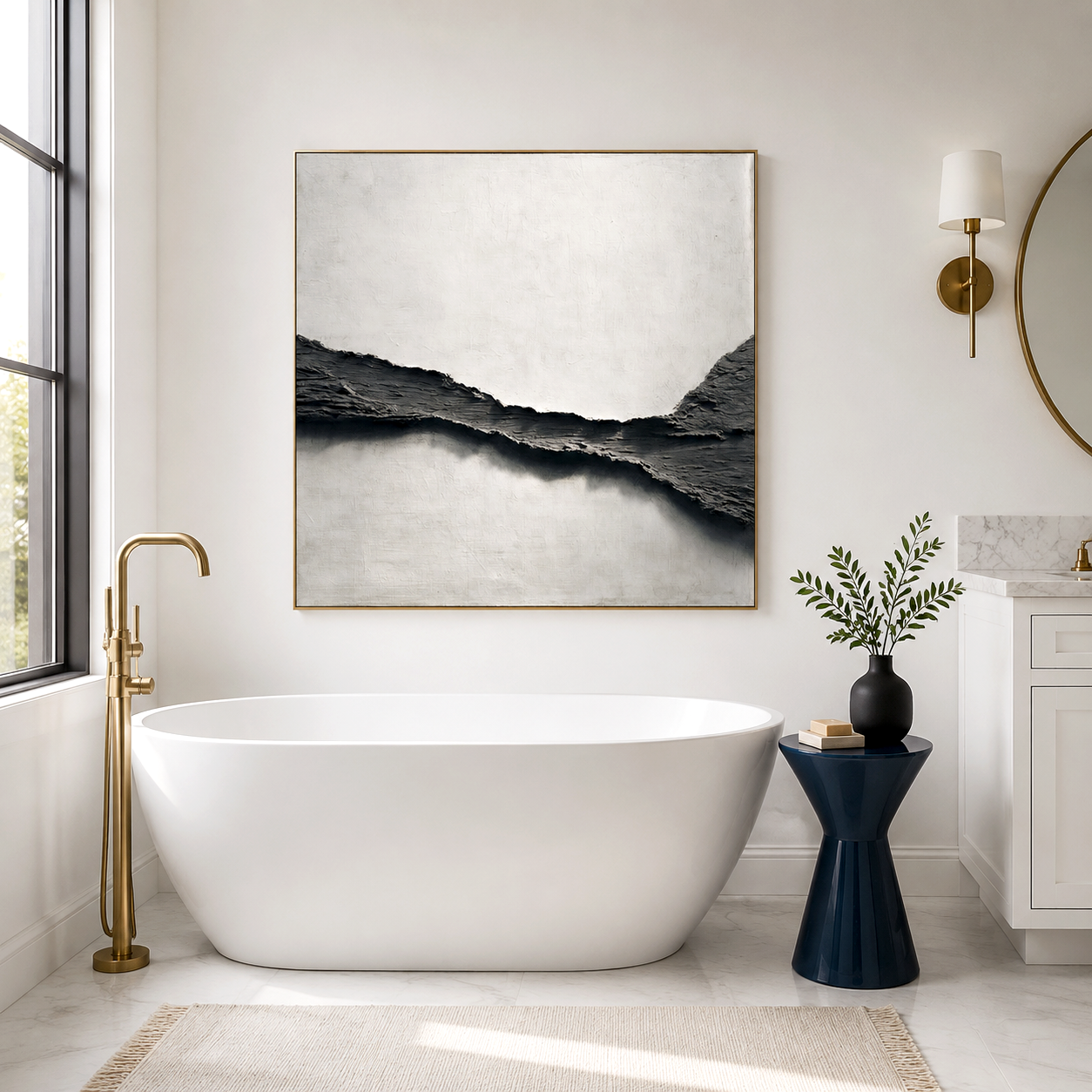
Why this style feels cooling
The appeal of marine serene comes from the way deep blue tones and textured surfaces work together. Blue is widely associated with calm, peace, and stability, while darker shades can feel more contained and restful than bright coastal colors. When that color is paired with ridged or relief-like texture, the eye has more to follow, which can make the wall feel quieter rather than louder.
That is why deep calm interiors often lean on a large, cool-toned canvas instead of multiple smaller decorative pieces. A single strong surface can do more for the room’s mood than several competing accents. The result is not “cold” in a literal sense, but it can create a convincing visual impression of freshness and relief.
Where it works best
This look is especially effective in spaces that already carry a lot of visual or social activity. A city living room with hard floors, a high-traffic lobby, a spa reception area, or a private meditation room can all benefit from a piece that slows the eye down. The best placements are usually walls that face seating zones, entry views, or mirror-heavy surfaces, because those are the areas where the room tends to feel busiest.
In quieter homes, the style also works as a reset point for open-plan layouts. A large wall in marine serene tones can anchor the seating area and keep the room from feeling scattered. The key is scale: the artwork should feel intentional enough to hold attention, but not so decorative that it competes with the rest of the interior.
Texture does more than decorate
A deep blue textured canvas is not only about color; it is about surface behavior. 3D linework, oceanic relief art, and layered brush or sculptural marks catch light differently across the day, which gives the wall depth without requiring bright contrast. That subtle movement helps the piece stay interesting from close range and still read as calm from across the room.
This is one reason the style pairs well with calm maritime painting ideas that avoid literal beach scenes. Instead of waves, shells, or sunset imagery, the focus stays on mood, material, and shadow. In modern interiors, that restraint usually feels more expensive and easier to live with over time.
When the effect disappoints
The main mistake is treating marine serene as a shortcut for a room that is still visually chaotic. If the surrounding furniture is already busy, reflective, or mismatched, the artwork will not magically create stillness. A cool palette can also feel dull if the room has no warmth at all, so lighting, fabric, and nearby finishes still matter.
There is also a common misunderstanding around acoustic expectations. Textured wall art can contribute to a calmer room feel, and some acoustic art formats may help reduce echo depending on their construction and placement, but decorative artwork is not the same as full soundproofing. In other words, it may soften the room’s acoustic feel, but it will not block outside noise or replace proper acoustic planning.
How to choose the right piece
The simplest rule is to match the artwork to the wall’s job. If the wall sits in a bright, social room, choose deeper marine blues with stronger texture so the piece can hold presence. If the room is smaller or darker, a softer layered blue with more open movement will usually feel less heavy.
This is also where a hand-painted approach can matter. Acousart, for example, positions its work around hand-painted oil art and acoustic wall art, which makes it a relevant reference point for people comparing decorative texture with room comfort rather than choosing a flat print. That combination is most useful when the goal is atmosphere first, with acoustic support treated as a secondary benefit.
Using it without overdoing it
Marine serene works best when it stays disciplined. One large piece is usually stronger than a cluster of similar blue works, because repetition can flatten the sense of depth. It also helps to keep surrounding materials simple: natural wood, matte paint, stone, linen, or boucle can all support the cool tone without making the room feel stark.
Lighting matters just as much as the artwork itself. Side light, warm ambient light, or a gently angled fixture will bring out the relief surface and keep the blue from reading as lifeless. If the room is lit only with bright overhead light, the texture can disappear and the whole effect becomes less convincing.
Frequently Asked Questions
Is marine serene the same as coastal wall art?
No, marine serene is usually more restrained and atmospheric than typical coastal art. It focuses on depth, quiet color, and texture rather than beach scenes or obvious nautical symbols. That makes it better for interiors that want calm without looking themed.
Does deep blue wall art make a room feel colder?
It can, but not in a bad way. Deep blue often feels refreshing and composed, especially when paired with warm lighting and natural materials. If the room already lacks warmth, balance it with wood, textiles, or softer neutral finishes.
Can textured wall art help with sound?
It can help a room feel less harsh, and some acoustic art pieces are designed to support sound absorption. But decorative texture alone should not be treated as a replacement for proper acoustic treatment or soundproofing. The safest expectation is softer room behavior, not silence.
Where should marine serene art be placed for the strongest effect?
Place it where the eye naturally lands first, such as above a sofa, behind a reception desk, or on the main wall of a meditation room. That gives the room an immediate point of calm. If the wall is too small, the effect weakens quickly.
What should I avoid when choosing this style?
Avoid choosing only by color swatch. Size, texture depth, wall scale, and surrounding finishes matter just as much as the blue itself. A piece can look serene online and still feel too small, too flat, or too cold once installed.