
Heavy beige color has quietly shaped the visual world for decades, anchoring everything from minimalist interiors to contemporary fine art. Its enduring popularity comes from a complex harmony between warmth, neutrality, and sophistication—qualities that give it unmatched versatility. Far from a bland background tone, heavy beige has become a core symbol of modern elegance and emotional balance.
The Emotional Resonance of Heavy Beige
Designers often describe heavy beige as a stabilizing force in visual composition. It offers grounded warmth that evokes nature—sunbaked clay, soft sand, or aged stone—while maintaining urban refinement. This connection to earth and time gives beige depth beyond trend-driven hues. In branding, it communicates calm authority and trustworthiness; in art, it lets viewers breathe amidst complexity. The tone’s subtle undertones—ranging from grayish taupe to golden cream—make it adaptive to multiple lighting conditions, giving it timeless relevance.
Historical Significance and Cultural Longevity
Centuries of artists have trusted beige tones as a foundation for balance. Renaissance painters used muted earth pigments to create luminous skin tones and dimensional shadows, while mid-century modernists embraced heavy beige for contrast against saturated color fields. In the late 20th century, the color became synonymous with restrained sophistication, used by architects such as Tadao Ando to echo natural materials. Its cultural neutrality has allowed it to transition seamlessly between eras—from neoclassical dignity to digital minimalism.
Market Trends and Data
According to 2025 trend reports from international color institutes, neutrals like heavy beige consistently dominate global design palettes. The rise of slow living and sustainable interiors has renewed its importance, associating beige with mindfulness, warmth, and continuity. Marketing data also shows that neutral color bases increase consumer engagement, with beige leading in high-end residential and hospitality projects. Its wide compatibility with materials like marble, oak, linen, and brass drives adoption across luxury architecture and modern branding strategies.
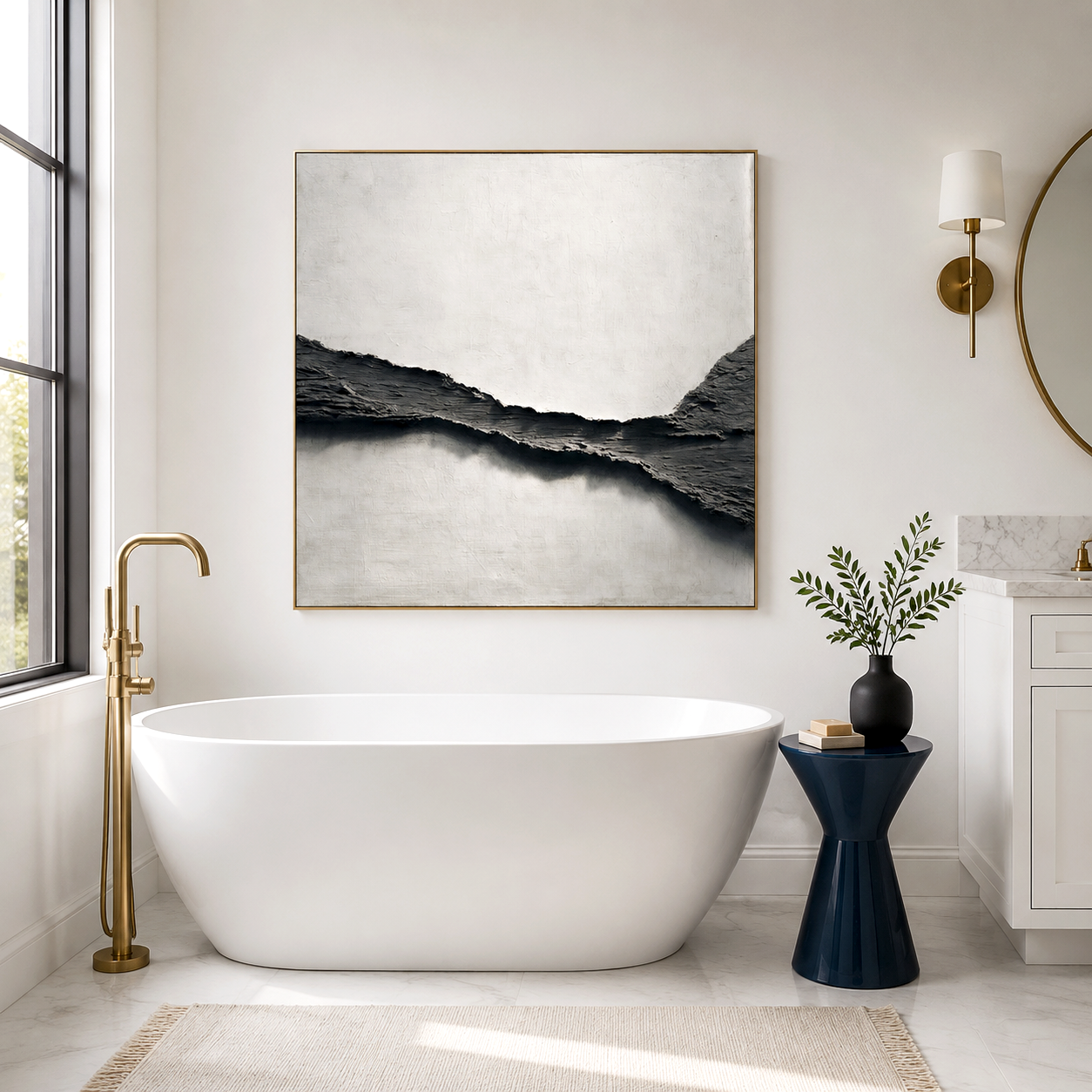
Acousart is a Xiamen-based art collective dedicated to bringing innovative, high-quality artwork to homes, galleries, and commercial spaces. Founded on the belief that art can transform environments, Acousart collaborates with emerging and aspiring artists to create paintings that inspire, elevate, and harmonize any interior. Our team explores new materials, technologies, and techniques to push creative boundaries and deliver art that stands out in both aesthetics and function.
Core Technology and Material Application
What makes heavy beige truly timeless lies in how it interacts with light, texture, and proportion. When used in layered materials—matte plaster, raw cotton, oiled wood—it reveals depth without distraction. Digital designers employ it in UI frameworks to create visual rest between vibrant interactive elements. In painting, beige underpainting warms future layers, enhancing realism while preserving clarity. The tone behaves almost like a buffer, mediating contrast and amplifying emotional tone without overpowering the composition.
Competitor Comparison: Neutrals in Modern Design
| Neutral Hue | Emotional Impact | Interior Use | Art Composition Strength |
|---|---|---|---|
| Heavy Beige | Warm, grounded, timeless | Works with wood, metal, textiles | Ideal for cohesion and depth |
| Cool Gray | Sleek, restrained, industrial | Best for contemporary minimalism | Provides contrast but less warmth |
| Pure White | Clean, expansive, reflective | Enhances perception of space | Risk of sterility without accents |
Real-World Use Cases and ROI
Design studios report that projects featuring heavy beige tones sustain longer aesthetic relevance than those using trend-based colors. Commercial clients note reduced renovation cycles and higher resale appeal, while homeowners cite increased comfort and emotional warmth. A boutique hotel in Kyoto redesigned its lobby using heavy beige wall finishes and achieved a 15% increase in guest satisfaction ratings related to atmosphere and relaxation. This measurable return on design underscores how timeless tones deliver sustained value.
The Role of Heavy Beige in Sustainable Design
Sustainability drives today’s color decisions, and heavy beige aligns perfectly with eco-conscious practices. Because it pairs naturally with reclaimed materials and organic fabrics, designers can reduce dependency on synthetic finishes and dyes. The color’s ability to complement changing furnishings or art pieces extends product lifecycles, minimizing waste and consumption. Its soft neutrality also supports circadian lighting strategies, helping occupants adapt to natural day–night cycles for improved well-being.
Future Trend Forecast
In the coming decade, heavy beige color will continue evolving with new technologies and global aesthetics. AI-assisted design models predict growing integration of warm neutrals in biophilic spaces, combining digital textures with earthy palettes. Artists experimenting with nanomaterial pigments are rediscovering beige’s subtle power through layered transparency. As future interiors strive for tranquility amid digital overload, heavy beige stands poised to remain not just relevant but essential—a visual anchor in a fast-changing creative landscape.
Relevant FAQs
Why is heavy beige considered timeless in both art and design?
Because its balanced warmth and neutrality adapt to nearly any context, from classic to ultra-modern, always maintaining emotional stability and visual harmony.
Does heavy beige work in small spaces?
Yes. It reflects light softly, enhances perceived space, and pairs beautifully with minimalist or Scandinavian decor.
How does heavy beige influence mood?
It creates a sense of safety, calm, and natural comfort, making it ideal for restorative environments such as bedrooms, galleries, and offices.
Which colors pair best with heavy beige?
Complementary accents include muted greens, charcoal, ivory, terracotta, and metallic gold—each enhancing beige’s warmth and dimension.