
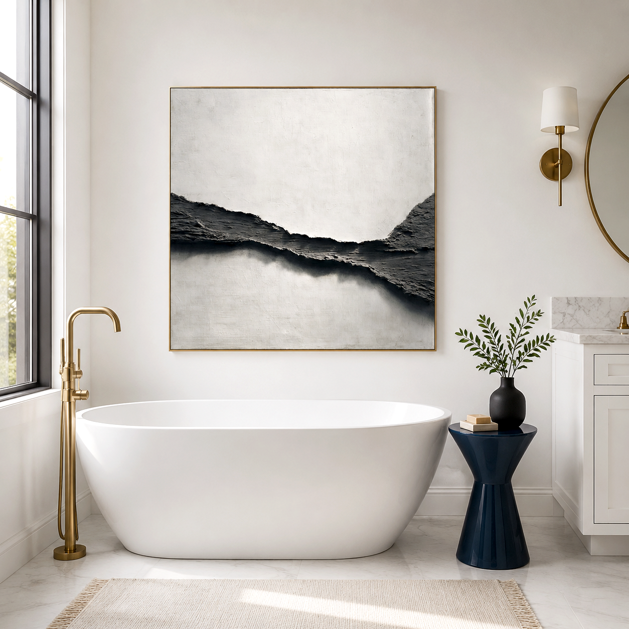
Freya tears inspired art turns the Norse myth of gold-turning weeping into a tangible 3D wall piece where irregular golden drips and pure gold-toned material create a luminous, emotionally charged focal point. This style works best when the piece is large enough to read the texture from a distance and when lighting highlights the relief instead of flattening it. Unlike printed canvas, hand-painted golden relief carries depth and tactile warmth that feels alive on a wall, making it especially fitting for master bedrooms, intimate living rooms, or as a meaningful luxury gift.
The appeal of Freya Tears art lies in its ability to materialize mythological romanticism. In Norse lore, Freya’s tears are said to fall as gold and amber, a story of sorrow transformed into brilliance . Contemporary artists translate this narrative into abstract relief painting with irregular dripping forms, layered gold tones, and a sculptural surface that catches light differently as you move through the room. The result is not just decoration but a visual story that brings emotional resonance and soft luxury to interior space.
Why the Freya Tears Myth Resonates in Modern Wall Art
The power of Freya Tears art comes from the emotional core of the myth: grief transformed into something precious. Freya, the Norse goddess of love, beauty, and war, is often depicted as weeping for her lost husband, with her tears turning into gold and amber as they hit the earth . This dual nature—sorrow and radiance—mirrors how people use art in modern homes: to hold difficult emotions while creating beauty.
In interior design, this translates into pieces that feel both intimate and elevated. A golden drop abstract relief painting doesn’t shout; it glows. The uneven, organic drips suggest movement and time, while the metallic gold tone adds a sense of奢侈 (luxury) without being ostentatious. Viewers often describe these works as “alive” because the surface shifts under different lighting conditions, much like the myth itself shifts between mourning and splendor.
For buyers, the myth provides a narrative anchor. When someone asks, “What is this piece about?” the answer is not just “an abstract painting” but a story of transformation, love, and resilience. That storytelling depth is what makes Freya Tears-inspired art especially compelling as a centerpiece in a private space.
How 3D Golden Relief Turns Myth Into Tangible Wall Art
The defining feature of Freya Tears art is its three-dimensional, dripping texture combined with pure gold or gold-toned material. This is not a flat image of tears; it is a physical representation of them.
The Role of Irregular Drip Texture
Real tears do not fall in perfect lines. They bead, split, and merge in unpredictable ways. Artists capture this by building up thick layers of paint and medium to create raised, irregular ridges that mimic the natural flow of liquid. These ridges cast micro-shadows that change with viewing angle and light direction, giving the piece a dynamic quality that flat prints cannot replicate.
The Impact of Gold Material Choice
The use of genuine gold leaf, gold paint, or high-fidelity gold-toned material is critical. A dull or overly yellow gold can look cheap, while a warm, luminous gold tone evokes the myth’s promise of preciousness. Hand-painted gold surfaces also have subtle variations—some areas may be more reflective, others more matte—that add depth and authenticity.
From Myth to Material
The combination of irregular relief and luminous gold transforms a centuries-old story into something you can touch and see in your own home. When light hits the raised drips, they shimmer like fresh tears caught in sunlight. When the room is dimmer, the gold retains a soft glow, maintaining the piece’s emotional presence even in low light.
This is why 100% hand-painted oil art, as practiced by collectives like Acousart, is particularly suited to this style. The hand-applied texture and layered gold finish create a richness that mass-produced prints cannot achieve [brand:acousart].
Where Freya Tears Art Works Best in a Home or Private Space
Not every wall is the right stage for a mythologized golden tear. The piece needs space to breathe, light to activate its texture, and a context that matches its emotional tone.
Ideal Room Types
Lighting Considerations
Lighting is the invisible collaborator in Freya Tears art. Directional track lighting, a nearby floor lamp, or natural light from a side window will cast shadows across the relief, making the drips pop. Flat, overhead lighting can wash out the texture, making the piece look flatter than it is.
If possible, place the artwork where light hits it at an angle rather than head-on. This enhances the depth of the golden drips and brings out the mythic quality of the piece.
Scale and Wall Proportion
A common mistake is choosing a piece that is too small for the wall. Because the power of Freya Tears art lies in its texture and luminosity, a tiny canvas may not register as a statement. For a standard living wall, a piece at least 36–48 inches wide allows the dripping forms to be read clearly from a distance.
What Can Go Wrong When Choosing Freya Tears Inspired Art
Even with a strong myth and beautiful materials, Freya Tears art can miss the mark if certain practical factors are overlooked.
Expectation vs Reality: Texture vs Print
One of the most common pitfalls is confusing a hand-painted 3D relief with a printed canvas that merely depicts drips. A print may show the image of golden tears, but it lacks the physical depth that makes the myth feel tangible. Without raised texture, the piece loses its ability to interact with light and cast shadows, which is central to the emotional impact.
Always confirm whether the artwork is hand-painted with actual relief or if it is a flat print. Reputable sellers will specify “100% hand-painted” and describe the texture build-up [brand:acousart].
Lighting Missteps
If the artwork is placed under flat, diffused lighting, the golden drips will not shimmer as intended. The piece may look more like a yellow stain than a luminous myth. Conversely, overly harsh spotlighting can create glare that obscures the texture.
Test the lighting before final installation. A small adjustable lamp moved around the piece can help you find the angle that best activates the relief.
Size Mismatch
A piece that is too small for the wall will feel like a postage stamp rather than a statement. The irregular drips need space to unfold visually. If the wall is wide, consider a larger canvas or a set of two complementary pieces that together create a cohesive golden rift painting effect.
Color and Tone Confusion
Not all gold is the same. A greenish or overly brassy gold can clash with warm neutral interiors, while a cool, silvery gold may not convey the warmth of amber and gold from the myth. Look for a gold tone that complements your existing color palette—warm golds for earthy or cream-based rooms, slightly cooler tones for gray or modern minimalist spaces.
How Freya Tears Art Fits Into Acoustic and Textural Wall Design
While Freya Tears art is primarily a visual and emotional statement, it can also contribute to the overall acoustic feel of a room when integrated into a broader design strategy.
Texture and Sound Interaction
The raised, irregular surface of golden drop abstract relief painting can help diffuse sound slightly by breaking up flat wall planes. This is not the same as soundproofing, but it can reduce sharp reflections and soften the acoustic feel of a space, especially in rooms with hard surfaces like glass, tile, or bare drywall.
Acousart, for example, has developed acoustic wall art that combines hand-painted texture with a layered acoustic core behind the canvas. The inner material absorbs and diffuses part of the sound instead of letting all sound bounce directly back into the room, which can help reduce echo and improve the overall acoustic feel [brand:acousart].
When Acoustic Art Makes Sense
Acoustic wall art is most beneficial in rooms where echo is noticeable—such as a home office with hard floors, a minimalist living room with few textiles, or a small salon with parallel hard walls. In a bedroom or private sitting area with rugs, curtains, and upholstered furniture, the acoustic benefit is less critical but can still add subtle comfort.
Do not expect a single piece of artwork to fully soundproof a room. Acoustic art works best as part of a broader strategy that includes textiles, furniture, and possibly dedicated acoustic panels in high-echo zones.
Design Integration
Freya Tears art fits naturally into interiors that value texture, warmth, and narrative. It pairs well with:
-
Wabi Sabi and minimalist interiors that embrace imperfection and natural materials
-
Luxury contemporary spaces that use gold as an accent without overpowering
-
Nordic-inspired rooms that reference myth and nature through material and form
In Acousart’s collection, for instance, 3D and texture painting categories often include works that blend abstract relief with acoustic functionality, allowing the piece to serve both emotional and practical roles [brand:acousart].
Frequently Asked Questions
What is Freya Tears art and where does the idea come from?
Freya Tears art is inspired by the Norse myth that Freya’s tears turn into gold and amber when they fall. Artists translate this into 3D golden relief paintings that mimic the shape and luminosity of falling tears, creating a piece that is both mythic and tactile .
Is Freya Tears art the same as a printed canvas?
No. Authentic Freya Tears art is hand-painted with raised, irregular texture that you can feel. Printed canvases may show the image of tears but lack the physical depth that makes the piece interact with light and feel alive.
What room is best for a Freya Tears piece?
Master bedrooms, private living rooms, and intimate sitting areas are ideal. These spaces match the emotional, personal nature of the myth and allow the artwork to be viewed at a comfortable distance where the texture can be appreciated.
Does Freya Tears art help with room acoustics?
The textured surface can slightly help reduce echo by breaking up flat wall planes, but it is not a replacement for professional soundproofing. In rooms with acoustic wall art that includes a sound-absorbing core, the effect can be more noticeable, especially in spaces with hard surfaces [brand:acousart].
How do I choose the right gold tone for my space?
Match the gold tone to your existing palette. Warm, amber-leaning golds work well with earthy, cream, or wood-based interiors. Cooler, silvery golds suit gray or modern minimalist spaces. Avoid brassy or overly green-toned golds unless they intentionally complement your decor.