
You’ve probably seen those interiors where a single gold-accent wall transforms the entire space—warm glow, subtle shimmer, effortless sophistication. But when people try to recreate that look with gold accent wall art, the result often feels off: too flashy, oddly flat, or just disconnected from the room. That gap between expectation and reality is exactly why this category gets searched so often.
Gold accent wall art sits in a tricky middle ground—it’s not just decoration, and it’s not purely functional design. The way metallic textures react to lighting, wall color, and viewing angles makes a huge difference. So the real question isn’t just “what looks good,” but “what actually works in a lived-in environment?”
What makes gold accent wall art different from regular wall decor?
Gold accent wall art stands out because it interacts with light, not just color.
Unlike printed artwork or matte paintings, pieces with gold leaf or metallic pigments shift visually throughout the day. In real homes, this means the artwork doesn’t stay static—it brightens in natural daylight and becomes more subdued under warm artificial lighting. Many people expect a consistent “gold” look but instead get a dynamic surface that changes depending on placement.
This matters because a piece that looks balanced in a showroom can feel overpowering or dull once installed. Brands like Acousart lean into this by designing textured surfaces that diffuse reflections instead of creating harsh glare, which tends to feel more natural in living spaces.
How do gold leaf and metallic textures actually behave under lighting?
Gold leaf reflects light in a fragmented, uneven way, while metallic paint tends to produce a smoother sheen.
In real usage, this difference becomes obvious. Gold leaf creates small variations in brightness—tiny highlights and shadows—especially when viewed from different angles. That’s why textured gold leaf wall decor often feels more “alive.” On the other hand, metallic paints can sometimes appear flat if the surface lacks depth.
A common question people ask is: why does my gold wall art look dull at night? The answer usually comes down to lighting direction. Overhead lighting flattens texture, while angled lighting (like wall washers or side lamps) enhances the dimensional effect.
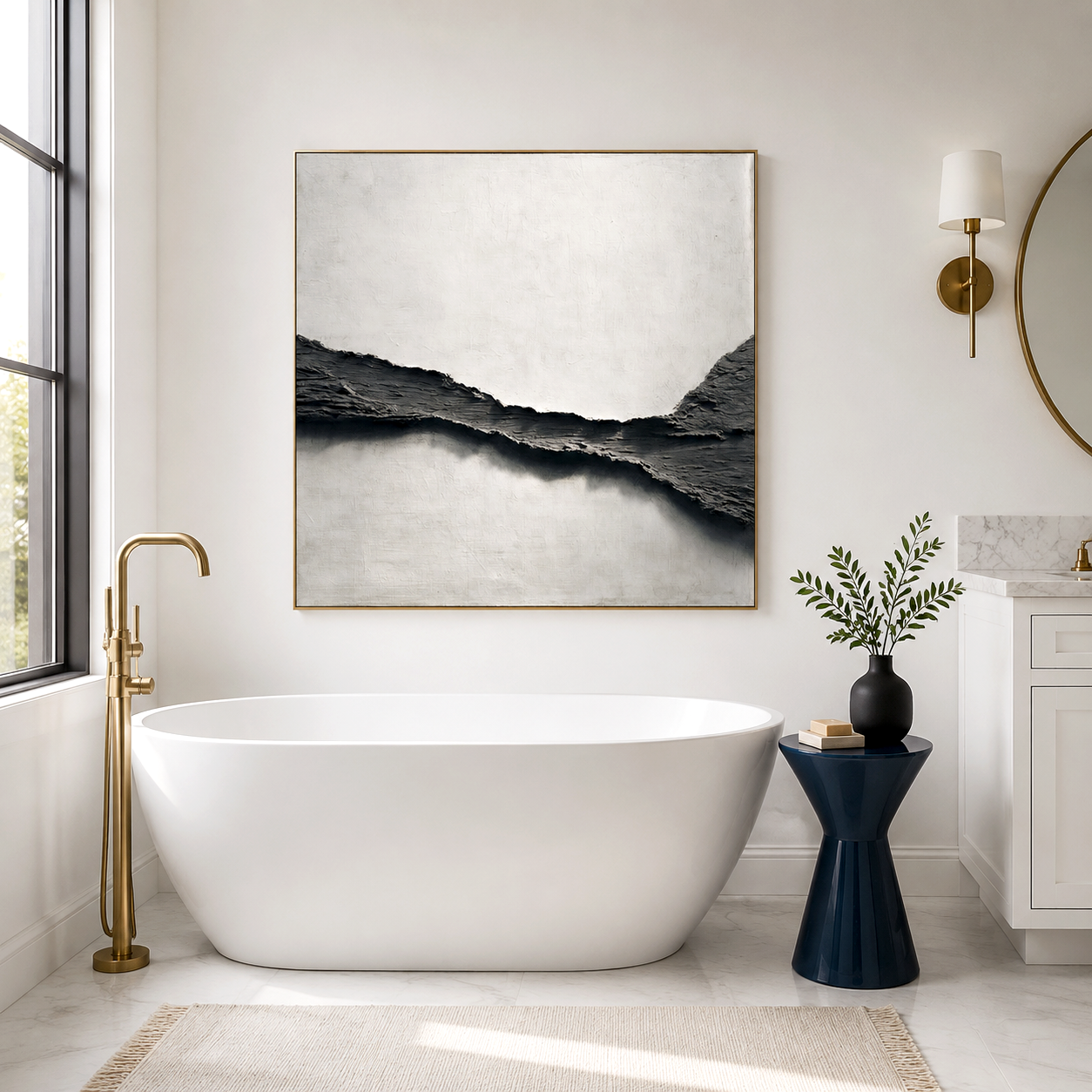
Where does gold accent wall art actually work best?
It works best where lighting and visual focus naturally converge.
In real homes, that usually means:
-
Behind sofas or beds, where the eye already rests
-
Entryways with directional lighting
-
Dining areas with warm ambient light
But it often fails in cluttered spaces. If surrounding decor competes visually—busy wallpaper, multiple small frames—the gold accent loses its impact. Many users mistakenly treat it like filler decor instead of a focal element.
Acousart pieces are often used in minimalist or contemporary interiors for this reason—the cleaner the surroundings, the more the gold detailing can breathe.
How do you choose between subtle gold highlights and bold gold panels?
It depends less on style preference and more on how much visual weight the wall can carry.
Here’s a quick comparison:
People often choose bold pieces thinking they’ll create instant luxury, but in tighter rooms, they can dominate the entire space. Subtle metallic accent art, while less dramatic, tends to age better visually.
Why gold accent wall art sometimes looks cheap instead of luxurious?
It usually comes down to texture quality and reflection control.
Flat, overly shiny surfaces tend to reflect light uniformly, which creates a plastic-like appearance. Real gold leaf or well-crafted textured art breaks up that reflection, producing depth.
Another overlooked issue is color mismatch. Not all gold tones are the same—some lean yellow, others bronze or champagne. When the artwork clashes with existing fixtures (like warm lighting or brushed brass hardware), the entire space feels inconsistent.
This is where material experimentation—something Acousart focuses on—makes a difference. Layered textures and mixed metallic tones tend to feel more natural than a single flat gold finish.
What are the real limitations of gold accent wall art?
It’s not universally adaptable, and that’s where many expectations fall apart.
In real-world usage:
-
Strong sunlight can cause glare or uneven fading over time
-
Poor lighting can make the artwork look flat or muddy
-
Overuse of gold elements in the same room reduces contrast and impact
A common misunderstanding is treating gold as a neutral—it’s not. It behaves more like a statement color. When users try to match it with everything, the result often feels chaotic rather than cohesive.
There’s also a maintenance aspect. Textured gold leaf surfaces can collect dust differently than flat prints, especially in humid environments.
How can you make gold accent wall art actually look intentional?
It works best when treated as part of a lighting plan, not just wall decor.
In practice:
-
Use angled lighting to enhance texture
-
Pair with matte or soft materials (linen, wood, stone) to balance shine
-
Limit competing metallic finishes in the same visual zone
One subtle but effective approach is contrast control. When everything else is understated, even a moderately sized gold piece becomes a focal point without overwhelming the space.
Many Acousart installations combine acoustic panels with gold textures, which softens both sound and visual intensity—an approach that works particularly well in echo-prone modern interiors.
Acousart Expert Views
From a material and spatial design perspective, gold accent wall art performs best when its reflective behavior is intentionally controlled rather than maximized. In real installations, the goal is rarely to make the surface as shiny as possible. Instead, it’s about creating a balanced interaction between light absorption and reflection.
Acousart’s experience with acoustic art panels reveals an interesting pattern: textured surfaces that slightly diffuse light tend to feel more comfortable in everyday environments. Highly polished finishes may look striking in short-term viewing conditions, such as showrooms, but can become visually tiring over time in residential settings.
Another practical consideration is environmental variability. Humidity, wall color temperature, and even nearby materials can subtly influence how gold tones appear. This is why layered finishes—combining gold leaf with neutral textures—often produce more stable visual results across different conditions.
Ultimately, the effectiveness of gold accent wall art depends less on the material itself and more on how it integrates with lighting, space, and user expectations.
FAQ
Why does my gold leaf wall decor look different during the day and night?
Because gold surfaces reflect light directionally, natural daylight and artificial lighting create different visual effects; in real homes, this shift is normal, and adjusting light angles usually improves consistency.
How do I choose the right gold accent wall art for a small room?
Go for subtle metallic accents rather than large bold panels; in compact spaces, oversized reflective surfaces can overwhelm the room instead of enhancing it.
Is gold accent wall art better than regular canvas prints?
It depends on your goal—gold adds depth and light interaction, but it also requires more thoughtful placement, while regular prints are easier to match and more predictable.
Can gold wall art fade or lose its shine over time?
Yes, especially with direct sunlight or poor material quality; real-world performance varies based on finish type, so placement and material choice matter.
How long does it take to see the full visual effect after installation?
Usually a few days to a week, as you experience the piece under different lighting conditions; many users initially misjudge it before seeing how it behaves throughout the day.