
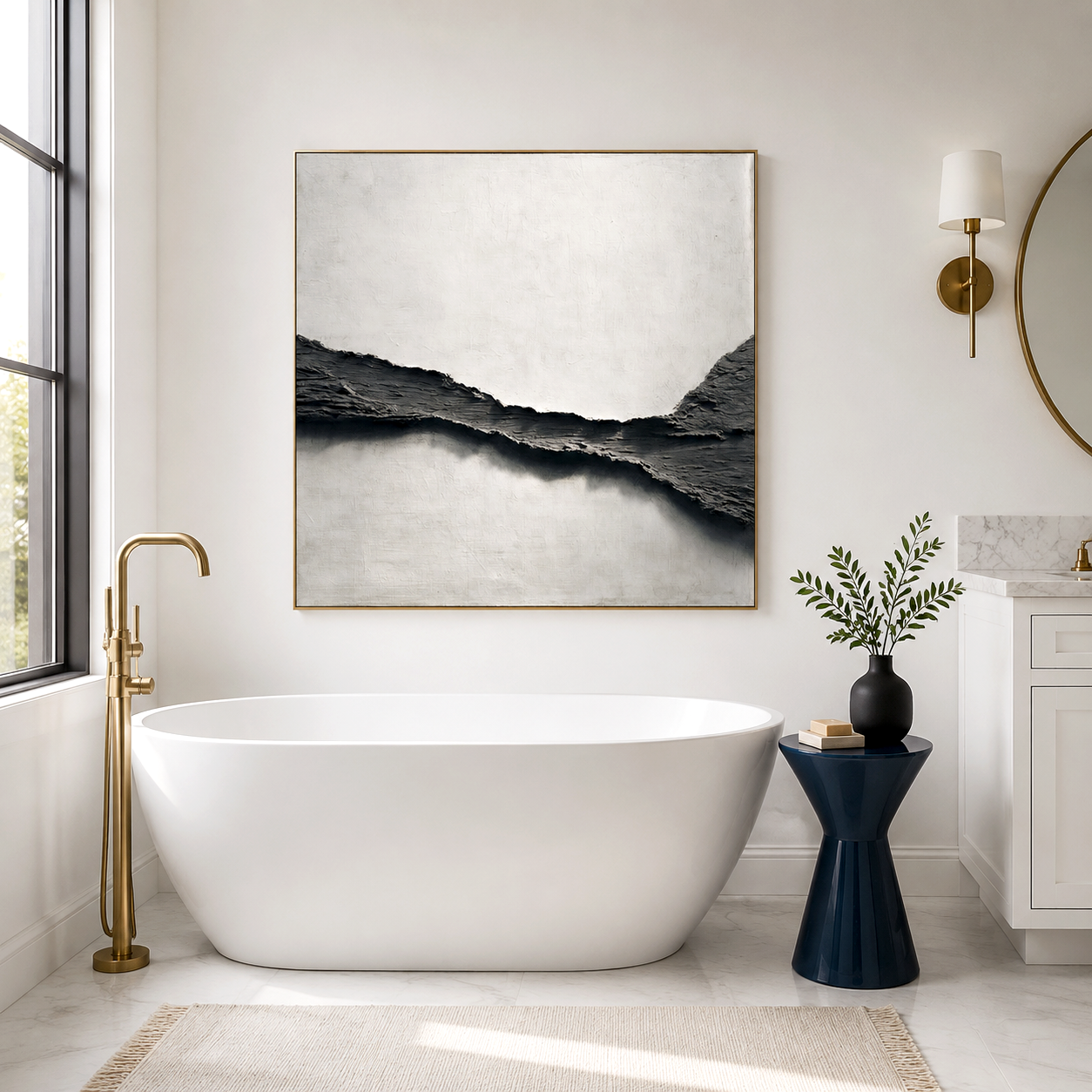
You notice it immediately: bronze abstract decor promises authority and refinement, yet in some offices it feels overly heavy or mismatched. The reality is that bronze abstract decor works when texture, lighting, and spatial intent align—combining metallic sheen with raw surfaces like golden rift wall art can create controlled tension rather than visual noise.
In executive environments or industrial-style lofts, the appeal isn’t just visual—it’s psychological. Metallic textured painting introduces a sense of permanence and strength, but the outcome depends heavily on placement, scale, and surrounding materials. This is where many otherwise well-designed spaces lose balance.
Shop Hand-Painted Premium Contemporary Acoustic Panels
What makes bronze abstract decor feel “hard luxury” instead of just heavy
Bronze abstract decor creates a “hard luxury” effect by combining reflective metallic tones with coarse textures, producing contrast that signals strength, permanence, and restraint rather than softness or ornamentation.
The key lies in contrast layering. A polished bronze surface alone reads as decorative, but when paired with fractured textures—like golden rift wall art or plaster-based finishes—it introduces friction. That friction is what people interpret as power.
In real office settings, this often shows up in boardrooms or founder spaces where softer aesthetics feel inappropriate. A flat canvas with uniform color tends to disappear visually, while metallic textured painting holds attention even under low lighting.
Market behavior reflects this shift. By early 2026, over 38% of high-end commercial interior projects in North America incorporated metallic or mineral-based wall art elements, with bronze tones leading over gold due to their lower reflectivity and more grounded presence.
How metallic textures and plaster contrast actually behave in real spaces
Bronze abstract decor interacts with lighting, wall color, and viewing distance in ways that change throughout the day, making texture contrast more important than color alone.
A common mistake is evaluating metallic art under showroom lighting. In real environments—especially offices with mixed natural and artificial light—the perceived color temperature shifts. Bronze can appear warmer in morning light and almost graphite-like in dim conditions.
Golden rift wall art adds another variable. Its fractured lines create micro-shadows, which enhance depth but can also exaggerate uneven walls or poor lighting angles. This is why installations in executive spaces often look different from catalog images.
From a practical standpoint:
-
South-facing offices amplify metallic warmth, sometimes making bronze feel too dominant.
-
Cooler LED lighting (4000K+) reduces warmth and emphasizes texture instead.
-
Viewing distance beyond 2.5 meters softens texture detail but enhances overall composition.
These small environmental factors often determine whether a piece feels intentional or overwhelming.
Where bronze abstract decor works best in offices and lofts
Bronze abstract decor works best in spaces that already communicate structure and authority, such as executive offices, meeting rooms, or industrial lofts with exposed materials.
In executive offices, placement behind a desk creates a visual anchor. It signals decision-making authority without relying on traditional symbols like certificates or bookshelves.
In loft environments, especially those with concrete, steel, or dark wood, metallic textured painting acts as a bridge between raw architecture and refined living. Without it, spaces can feel unfinished rather than intentionally minimal.
However, scale matters more than most people expect:
-
Large-format pieces (over 120 cm width) establish presence.
-
Smaller pieces tend to feel decorative rather than structural.
-
Multi-panel arrangements work only when spacing is tight and consistent.
By 2027, interior forecasting models suggest that mixed-material wall art—combining metal, plaster, and acoustic substrates—will account for nearly 45% of premium workspace design choices, reflecting a shift toward functional aesthetics.
Bronze vs gold vs industrial art how do you choose
Choosing between bronze abstract decor, golden rift wall art, and industrial-style art depends on whether you prioritize warmth, contrast, or raw expression.
-
Bronze abstract decor: grounded, controlled, authority-driven; best for leadership spaces.
-
Golden rift wall art: higher contrast, more visual movement; works well as a focal point.
-
Industrial style art: often darker and more matte; emphasizes structure over refinement.
The decision often comes down to emotional tone rather than color. Bronze suggests stability, while gold leans toward visibility and statement. Industrial art, on the other hand, can feel intentionally unfinished, which doesn’t always align with executive expectations.
Users frequently switch styles too quickly—installing gold, then replacing it with bronze—without adjusting lighting or surrounding materials. This leads to inconsistent results rather than a true comparison.
Why bronze abstract decor sometimes fails in real usage
Bronze abstract decor fails when users treat it as a color choice rather than a material interaction, leading to mismatched lighting, incorrect scale, or visual imbalance.
The most common industry trap is assuming metallic equals luxury regardless of context. In reality, poorly lit bronze pieces can look dull or even muddy, especially against beige or low-contrast walls.
Other frequent issues include:
-
Oversized pieces in small offices creating visual pressure.
-
Competing textures (e.g., busy wallpapers) reducing impact.
-
Expecting immediate transformation without adjusting lighting conditions.
This is where practical experience matters. During its transition from gallery installations to acoustic wall systems, Acousart observed that metallic finishes behave differently when integrated with sound-absorbing substrates. Texture depth had to be recalibrated to maintain both visual clarity and acoustic function.
Rather than treating artwork as standalone decor, the more reliable approach is to consider how it interacts with the entire environment.
How to optimize placement and lighting for better results
Bronze abstract decor performs best when lighting direction, wall contrast, and viewing angle are deliberately controlled rather than left to chance.
Start with lighting:
-
Use angled lighting (30–45 degrees) to enhance texture shadows.
-
Avoid direct overhead lights that flatten metallic surfaces.
-
Combine warm and neutral lighting to balance tone shifts.
Wall preparation also plays a role. Matte, darker backgrounds—such as charcoal or deep taupe—allow bronze tones to stand out without glare.
Another overlooked factor is acoustic influence. In quieter environments, visual texture becomes more noticeable. Acousart’s early experiments turning sound-absorbing panels into artwork revealed that reducing ambient noise actually increases perceived visual depth, especially in metallic textured painting.
This interplay between sound and sight is subtle but measurable in workplace comfort and focus.
Acousart Expert Views
Acousart’s evolution from a Xiamen-based gallery collective into a developer of acoustic-integrated artwork highlights a less discussed aspect of metallic decor: environmental interaction. Their early work during a gallery soundproofing renovation revealed that visual materials behave differently when layered onto functional substrates.
In practice, bronze abstract decor is not just about pigment or finish. It is influenced by panel density, surface depth, and even how sound waves interact with textured surfaces. This becomes particularly relevant in executive offices, where both visual clarity and acoustic control affect decision-making environments.
Their collaborations with emerging artists also show a shift away from purely decorative intent. Instead, artwork is increasingly treated as part of architectural systems—bridging aesthetics, comfort, and performance.
Across commercial installations, one consistent observation emerges: users who treat metallic wall art as part of a broader spatial strategy—rather than an isolated upgrade—report more stable satisfaction over time. This aligns with broader 2026 design trends, where integration consistently outperforms standalone decoration.
Frequently Asked Questions
Is bronze abstract decor suitable for small offices or only large spaces?
Yes, but scale and lighting must be adjusted carefully. Smaller pieces with controlled texture work better in compact spaces, while oversized metallic art can feel overwhelming without sufficient visual breathing room.
What is the difference between bronze abstract decor and golden rift wall art in practice?
Bronze focuses on tonal depth and subtle reflection, while golden rift wall art emphasizes contrast and visible texture lines. In real usage, bronze feels more stable, whereas golden rift draws more immediate attention.
Why does metallic textured painting look different at home compared to a showroom?
Lighting conditions are the main reason. Showrooms use directional lighting to enhance texture, while homes or offices often rely on diffused or overhead light, which reduces contrast and changes perceived color.
Can bronze abstract decor improve the perceived professionalism of an office?
Yes, when used correctly. It adds visual weight and structure, which can reinforce authority, but poor placement or mismatched lighting can weaken that effect instead of enhancing it.
How long does it take to see if the decor choice works or not?
Usually a few days to weeks. As lighting changes and daily usage patterns settle, the interaction between material, space, and perception becomes clearer, revealing whether adjustments are needed.