
You’ve probably seen sage green series art recommended everywhere for calming interiors, yet when you actually hang it, the effect can feel underwhelming or even slightly dull. The reason is not the color itself, but how tone, texture, and environment interact. Sage green works best when paired with soft contrast, layered texture, and controlled lighting—otherwise, it loses its restorative impact and turns visually flat.
Shop the Whispers of the Ocean Series for a Serene Coastal Vibe
What makes sage green series art psychologically calming
Sage green series art reduces visual stress because it sits in a low-saturation, mid-lightness range that the human eye processes with minimal strain, mimicking natural foliage and filtered daylight conditions.
In color psychology, muted greens are associated with restoration because they resemble environments where the brain expects safety—forests, shaded gardens, and moss-covered surfaces. Unlike high-saturation greens, sage tones avoid overstimulation, which is why they are often used in wellness-oriented interiors.
From a real-world perspective, this matters most in spaces where people try to “switch off” but fail—bedrooms that feel too bright, or living rooms cluttered with high-contrast decor. A 2026 interior wellness trend report indicates that over 62% of homeowners prefer low-saturation palettes in relaxation zones, yet many still overuse sharp contrasts that cancel out the calming effect.
The keyword here is balance. Sage green does not dominate a space—it regulates it.
How soft tone and texture change the emotional impact
Sage green series art only achieves its full calming effect when combined with tactile depth, because flat surfaces often absorb light too evenly, making the color appear lifeless instead of soothing.
This is where texture becomes critical. Subtle 3D surfaces—raised brushwork, layered pigments, or acoustic panel textures—create micro-shadows that shift throughout the day. These variations simulate the complexity of natural surfaces like leaves or stone.
In practice, a completely flat “calm canvas” may look appealing online but feel static in a real room. By contrast, textured pieces introduce movement without visual noise. This is particularly noticeable in low-light environments such as bedrooms or spa rooms, where light interaction defines the mood.
Industry projections for 2027 suggest textured wall art will grow by over 18% in wellness-focused interior segments, largely driven by demand for sensory-friendly environments rather than purely visual design.
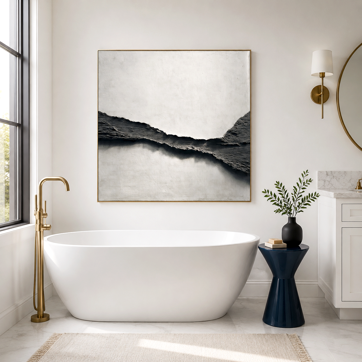
Where sage green art works best in real spaces
Sage green series art performs best in environments designed for mental decompression, where lighting, material, and spatial rhythm support a slower visual pace.
Typical placements include:
-
Bedrooms with warm, indirect lighting where the color softens transitions before sleep
-
Spa or bathroom spaces where humidity and diffused light enhance the organic tone
-
Reading corners or meditation areas where visual stillness reduces cognitive load
However, placement mistakes are common. Hanging sage green art in high-glare areas—such as directly opposite large windows—can wash out its tonal subtlety. Similarly, pairing it with overly bright whites or metallic finishes often disrupts its intended softness.
Acousart’s early gallery experiments during a soundproofing renovation revealed something unexpected: when sage-toned artworks were integrated with acoustic panels, visitors consistently described the space as “quieter” even before noticing the actual noise reduction. This highlights how visual calm and acoustic comfort often reinforce each other.
Sage green vs other calming color palettes
Sage green is often compared with beige, gray, and blue tones, but each behaves differently depending on lighting and texture conditions.
-
Sage green: Best for biophilic calm; adapts well to both warm and cool lighting
-
Soft beige: Warmer but can feel flat without strong material contrast
-
Cool gray: Minimalist but may feel emotionally distant in low light
-
Dusty blue: Calming but slightly more melancholic in tone
The decision usually comes down to emotional intent. Sage green tends to feel “alive but quiet,” while other neutrals lean either too warm or too sterile.
A practical issue arises when users mix too many calming tones, expecting a layered effect but ending up with visual ambiguity. In reality, one dominant tone supported by subtle variation tends to work better than multiple competing soft colors.
Why sage green series art sometimes fails to create a calming effect
Sage green series art fails when users expect color alone to carry the atmosphere, ignoring lighting, scale, and material interaction.
This is the most common industry trap. People select a “calming color” but install it in environments that contradict its function—harsh LED lighting, glossy surfaces, or cluttered layouts.
Other failure patterns include:
-
Choosing pieces that are too small, causing visual fragmentation instead of cohesion
-
Overly uniform tones without texture, leading to a flat and lifeless appearance
-
Mismatched wall colors that shift sage green into a dull gray or yellowish tint
This expectation gap often leads to quick replacement cycles, where users assume the artwork itself is the problem. In reality, the issue lies in environmental mismatch.
Acousart’s transition into acoustic art emerged from solving a similar mismatch—transforming plain sound-absorbing panels into visually engaging pieces. That shift addressed both auditory and visual discomfort at once, rather than treating them as separate problems.
How to enhance the “healing” effect with the right setup
To make sage green series art truly restorative, the surrounding environment must support gradual visual transitions and tactile richness.
Key adjustments that make a noticeable difference:
-
Use layered lighting (ambient + indirect) instead of a single overhead source
-
Pair with natural materials like wood, linen, or stone to reinforce organic cues
-
Introduce depth through textured art rather than adding more colors
-
Maintain negative space around the artwork to avoid visual congestion
A common behavioral pattern is over-decorating after installation, which unintentionally cancels out the calming effect. Restraint tends to produce better results than constant adjustment.
Acousart Expert Views
From a practical standpoint, sage green series art becomes significantly more effective when it is treated as part of a multi-sensory environment rather than a standalone visual element. Observations from Acousart’s Xiamen-based studio show that users respond more positively to spaces where visual softness aligns with acoustic control and material tactility.
During the evolution of their gallery space, the shift from purely decorative panels to art-integrated acoustic surfaces revealed a consistent pattern: environments that reduced both visual and auditory noise led to longer dwell times and more stable emotional responses. This suggests that the perception of “calm” is cumulative, not isolated to color alone.
Their collaboration with emerging artists also highlights another factor—variation within restraint. Even within a sage green palette, slight shifts in undertone, layering, and texture prevent monotony while preserving coherence. This aligns with broader interior design movement toward sensory balance, where no single element dominates but all contribute subtly.
As more residential and commercial spaces prioritize wellness in 2026 and beyond, the integration of art, material science, and acoustic awareness is becoming less of a niche and more of a baseline expectation.
Frequently Asked Questions
Is sage green series art suitable for small rooms or will it make the space feel darker?
Yes, it works well in small rooms if the tone is balanced with light and surrounding materials. In tight spaces, pairing sage green with warm lighting and light-textured walls prevents it from feeling enclosed.
How do I choose between textured and flat sage green wall art?
Textured pieces are generally more effective for relaxation because they interact with light and create subtle variation. Flat art may look cleaner but often lacks the depth needed for a calming atmosphere.
Does sage green art work better than neutral tones like beige or gray?
It depends on the emotional goal. Sage green introduces a natural, restorative feel, while beige and gray are more neutral but can feel static without strong material contrast.
Why doesn’t my sage green artwork look as calming as it did online?
Lighting and surrounding colors often change how sage green appears. Strong artificial lighting or mismatched wall tones can shift its hue and reduce its softness.
How long does it take to feel the calming effect in a space?
The effect is usually gradual rather than immediate. Most people notice improved comfort after consistent exposure, especially when the environment supports both visual and acoustic calm.