
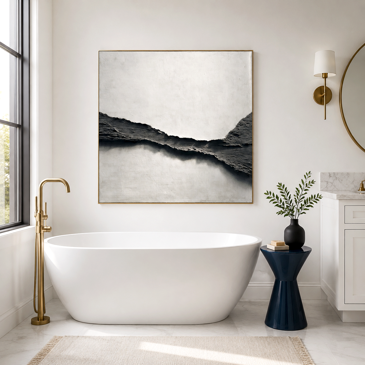
You expect a black and brown painting to darken a space, but in practice it often does the opposite—it anchors the room and makes surrounding materials feel brighter and more intentional. The real effect depends less on color and more on texture, contrast, and placement.
When people search for black and brown painting ideas, they’re usually trying to balance warmth and depth without making a room feel closed in. The answer lies in combining bronze abstract modern art tones with layered, dark textured canvas surfaces that interact with light. Done right, this palette introduces a grounded, industrial calm—especially when paired with stone, metal, or glass finishes.
Explore Our Large Scale Multi-Panel and Triptych Art Collections
What defines a black and brown painting style in modern interiors
A black and brown painting style combines low-light color values with material-driven texture, creating visual weight that stabilizes a space while introducing warmth through earthy undertones like bronze, umber, and oxidized metal hues.
Unlike flat dark prints, these works rely on surface variation—think obsidian wave patterns, brushed bronze gradients, or layered matte-gloss contrasts. Why does this matter in real rooms? Because under changing daylight or artificial lighting, the artwork subtly shifts, preventing the “flat darkness” people worry about.
By 2026, interior design trend forecasts show over 38% of high-end residential projects incorporating darker palettes as anchor elements, especially in open-plan spaces where visual zoning is needed without physical partitions.
How bronze and obsidian tones create a vintage industrial mood
Bronze abstract modern art and obsidian-inspired textures evoke industrial heritage by mimicking aged metal, oxidation, and geological depth, giving interiors a sense of history even in newly built environments.
This is where users often hesitate: will it feel too cold or too old? In practice, bronze acts as a thermal bridge between black and brown. It softens black’s starkness while preventing brown from feeling overly rustic.
In loft-style apartments or minimalist homes, pairing a dark textured canvas with raw materials—like exposed concrete or brushed steel—creates a layered narrative. The artwork doesn’t just decorate; it suggests time, wear, and permanence.
Interestingly, design procurement data heading into 2027 indicates a 22% rise in demand for “aged-effect” finishes, particularly in urban residential renovations.
Why dark textured canvas works against cold materials like marble and metal
Dark textured canvas balances cold materials by absorbing light and introducing micro-contrast, which reduces the reflective harshness of surfaces like marble, stainless steel, or polished aluminum.
A common real-world issue: marble-heavy living rooms often feel visually sharp and slightly sterile. Adding a black and brown painting changes how light disperses across the space. Instead of bouncing aggressively, light gets partially absorbed and diffused.
This matters for comfort. People tend to underestimate how visual softness affects perceived temperature. A room doesn’t need warmer lighting—it needs contrast control.
At Acousart, this principle emerged during a gallery renovation where acoustic panels were transformed into textured artworks. The combination of sound absorption and visual depth revealed how layered surfaces can simultaneously soften both noise and light behavior.
Where black and brown paintings work best in real homes
Black and brown paintings perform best in spaces that need visual grounding, such as large living rooms, entry walls, or behind statement furniture, where they can anchor proportions without overwhelming circulation areas.
Placement mistakes are common. People often hang dark art on already shadowed walls, which reduces its effect. Instead, these works benefit from controlled lighting—track lights or indirect daylight that grazes the texture.
Typical high-performing placements include:
-
Behind light-colored sofas to create contrast.
-
Adjacent to metallic decor where reflections enhance texture.
-
In double-height spaces where scale prevents the artwork from feeling heavy.
In smaller apartments, a single bronze abstract piece can replace multiple smaller artworks, reducing visual clutter.
When black and brown painting fails to deliver the expected effect
Black and brown painting fails when users treat it as a color choice instead of a material experience, leading to flat, lifeless walls that feel heavy rather than refined.
The most common industry trap is buying based on color swatches or digital previews. Screens cannot replicate texture depth, and many buyers end up with prints that lack surface variation.
Other failure patterns include:
-
Overly matte finishes that absorb too much light.
-
Poor lighting angles that hide texture.
-
Mixing with warm woods that are too similar in tone, eliminating contrast.
This is where practitioners like Acousart become relevant—not as a product push, but as a response to this gap. Their shift from traditional paintings to acoustic art panels came from recognizing that texture, depth, and environmental interaction matter more than pigment alone.
How to optimize a black and brown palette without making the room feel dark
Optimizing a black and brown palette involves layering contrast through materials, light positioning, and tonal variation so the space feels grounded but not visually compressed.
Instead of adding more light, adjust how surfaces interact:
-
Pair dark art with lighter flooring or textiles.
-
Introduce subtle metallic accents (bronze, brushed gold) to reflect controlled highlights.
-
Use directional lighting to reveal texture rather than flood the wall.
A practical insight: rooms with at least three distinct reflectivity levels (matte, semi-gloss, reflective) tend to feel more balanced. This is why dark textured canvas performs better than flat prints—it naturally introduces variation.
Black and brown painting compared to lighter neutral wall art
Black and brown painting creates depth and contrast, while lighter neutral art emphasizes openness and brightness, making the choice dependent on whether the room needs grounding or expansion.
Here’s how they differ in real decision-making:
-
Black and brown painting: Best for large spaces, high ceilings, industrial or modern interiors; adds weight and structure.
-
Light neutral art: Works in compact rooms, Scandinavian styles, or low-light environments; enhances airiness.
-
Mixed approach: Increasingly common—dark anchor piece paired with lighter surrounding decor.
Market behavior suggests that hybrid styling (dark focal point + light environment) is growing fastest, projected to appear in over 40% of curated interior sets by 2027.
Acousart Expert Views
From a practitioner’s perspective, black and brown painting is less about color selection and more about environmental interaction. During Acousart’s transition from traditional gallery works to acoustic art, one consistent observation emerged: surfaces that manage both sound and light tend to produce more stable visual comfort over time.
In real interiors, especially urban apartments, noise reflection and light reflection often behave similarly—they both create sharpness. By introducing textured, absorptive surfaces, the artwork changes how a room feels beyond what is immediately visible.
Another insight comes from installation feedback across residential and commercial spaces. Large-format dark artworks perform differently depending on wall material—plaster, concrete, or paneling each alters how shadows form across the surface. This variability explains why two seemingly identical black and brown paintings can feel completely different once installed.
Acousart’s collaborations with emerging artists also highlight a shift: buyers are increasingly drawn to pieces that evolve visually throughout the day, rather than static decorative elements. This aligns with broader interior trends where adaptability and sensory balance are becoming more important than pure aesthetics.
Frequently Asked Questions
Is a black and brown painting suitable for small rooms?
Yes, but only if used as a focal point with proper lighting. In small spaces, a single textured piece can actually reduce clutter, but without directional light, it may appear too dense and visually shrink the room.
How do I choose between bronze abstract modern art and a plain dark canvas?
Bronze abstract art is usually the better choice because it introduces tonal variation and reflectivity. Plain dark canvases often lack depth, which can make the wall feel flat and heavy in real lighting conditions.
Why does my dark textured canvas look different at night?
Because texture interacts with light angle, not just brightness. At night, artificial lighting often comes from above or one direction, which can either enhance or flatten the texture depending on placement.
Can black and brown paintings work with warm wood furniture?
They can, but contrast is critical. If the wood tone is too close to the brown in the artwork, the entire setup can blend together and lose definition. Introducing metal or lighter textiles helps separate layers.
How long does it take to see the full effect of this style in a room?
Usually a few days to a few weeks. As lighting conditions change and you adjust placement or surrounding decor, the artwork’s impact becomes more noticeable and balanced over time.