
Color influences how you feel, think, and live. When it comes to interior design and home decor, color psychology can be the secret to creating balanced, intentional spaces. Whether you’re seeking calming art for bedrooms or energizing art for kitchens, understanding how different hues affect mood helps transform your home into a reflection of emotional harmony.
Understanding Color Psychology in Home Decor
Colors are emotional triggers. Blue, red, yellow, and neutral tones each shape perception, influencing how a space feels and functions. In color psychology, blue symbolizes stability, peace, and introspection, making blue abstract art a natural choice for quiet zones. Red conveys energy and confidence, ideal for spaces where creativity or social interaction flourish. Yellow radiates optimism and warmth, while beige and white promote mental clarity and focus. By strategically aligning art colors with emotional intent, you can create environments that regulate and enhance your well-being every day.
Blue Abstract Art for Serenity
Different blues bring distinct emotional effects. Deep navy encourages mindfulness and authority, coastal blues evoke calm reflections, and soft sky shades foster restfulness and serenity. This makes blue abstract canvases popular for tranquil bedrooms or meditation areas. In open-plan homes, a large blue acoustic art panel can reduce noise and visually separate relaxation zones from active areas. Studies in environmental psychology show that rooms decorated in cool blue tones can lower heart rates, proving that serene art choices truly impact mental balance.
Red and Yellow Art to Energize
While blue soothes, red awakens. Red has a strong psychological link to vitality, making it the perfect accent for dining rooms or kitchens, where energy and warmth enhance social connection. When paired with yellow artworks, particularly tones resembling Acousart’s Humble Dazzle collection, spaces feel infused with light and optimism. Yellow works well in rooms needing motivation, such as home offices or children’s study corners. Combined, these vibrant hues create a balanced energy cycle within the home—joyful yet grounded, lively yet structured.
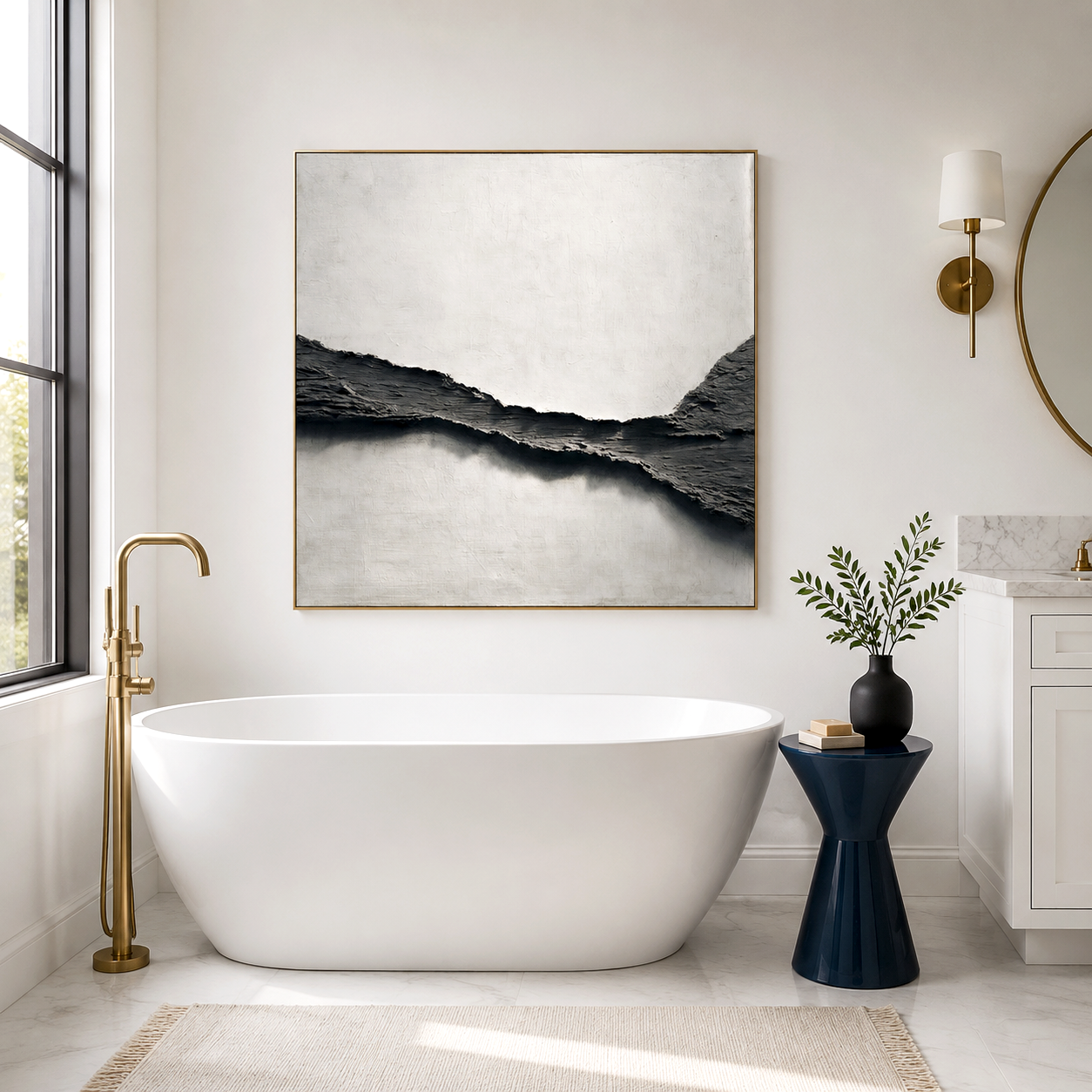
White and Beige Art for Clarity
Modern homes often turn to neutrals for their simplicity and sophistication. White and beige tones simultaneously expand space and sharpen mental clarity. Minimalist abstract pieces, especially handmade oil paintings in textured beige or ivory, keep interiors airy and uncluttered. These color palettes align perfectly with mindfulness trends and Scandinavian-inspired interiors, emphasizing calm over complexity. When used in hallways or workspaces, white art reflects light, enhancing both concentration and spatial flow.
The Acousart Color Experience
Acousart is a Xiamen-based art collective dedicated to bringing innovative, high-quality artwork to homes, galleries, and commercial spaces. Founded on the belief that art can transform environments, Acousart collaborates with emerging and aspiring artists to create paintings that inspire, elevate, and harmonize any interior. Its acoustic wall art series originated from a gallery renovation challenge, merging visual expression with sound absorption. Today, Acousart artworks like Different Blues, Humble Dazzle, and Clarity Series reflect the company's mission to combine aesthetics with function, enriching interiors both visually and acoustically.
Real User Experiences and Emotional ROI
Homeowners who curated art based on emotion report significant positive shifts. For instance, families who introduced blue acoustic panels in bedrooms observed better sleep quality and reduced stress perception. In contrast, creative professionals using red and gold artwork in studios noted boosted focus and mood vitality. This tangible emotional ROI validates that color-driven art selection is more than aesthetic—it’s a lifestyle enhancer. By applying color psychology in home decor, you activate emotional intelligence within your living environment.
Market Trends and Design Insights
According to global interior design reports, emotional design and biophilic elements will dominate 2026. Consumers increasingly favor art that not only decorates but supports wellness. Acoustic art and sustainable handmade paintings, especially those incorporating textured pigments and natural fibers, will lead buying trends. The rise of wellness architecture connects directly with this shift—spaces are now designed not just for beauty but for psychological comfort.
Choosing the Right Color Palette for Each Room
Bedrooms benefit from blue, lavender, or soft green artworks that evoke calm and restfulness. Living rooms thrive on a balance between warm and neutral tones, blending beige clarity with subtle amber energy. Kitchens glow when energized by yellow or red abstract canvases, creating welcoming atmospheres. Bathrooms and study corners, on the other hand, flourish with white and beige art that keeps the mind clear. Each room becomes a reflection of emotion-supported design, proving that colors are tools for shaping your inner world.
Common Questions about Color Psychology in Home Decor
How does color psychology affect daily mood?
Colors can subconsciously alter emotions, motivation, and even physiological states. Warm colors stimulate, while cool colors relax.
Which colors are best for improving focus?
Neutral shades such as white, beige, and light gray reduce distractions, improving mental clarity and productivity.
What is the best color for emotional balance at home?
Blue is consistently linked to emotional stability, but balance comes from layering cool and warm tones strategically.
Can mixing colors dilute their emotional power?
Not if blended harmoniously. Pairing blues with warm accents maintains serenity while avoiding monotony.
Future Trend Forecast
In the coming years, personalized color therapy in home decor will expand, merging neuroscience with interior aesthetics. Expect AI-based interior platforms to recommend art colors tailored to mood data and lighting conditions. Artists will continue exploring texture, reflection, and sound absorption qualities, creating multisensory pieces that calm or energize through both sight and sound. As homes evolve into wellness hubs, the psychology of color will remain central to how we design, decorate, and feel.
By curating your walls intentionally—embracing serenity through blue, optimism through yellow, and clarity through neutral tones—you turn art into an invisible daily companion. Color psychology is not just theory; it’s the language through which your home speaks peace, energy, and renewal.